A warm, welcoming website designed for an early learning community
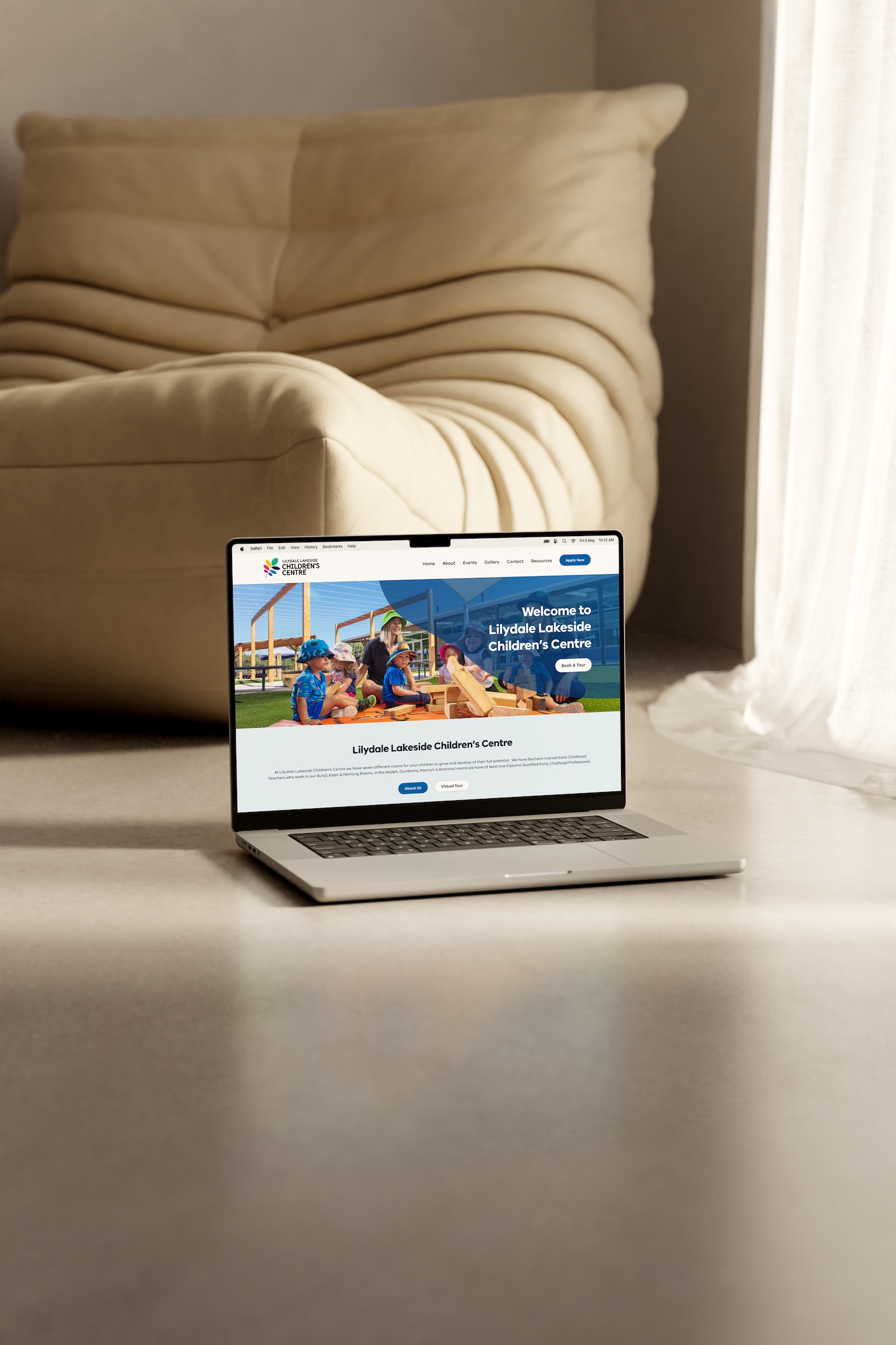
For Lilydale Lakeside Children’s Centre, we designed and developed a modern WordPress website that brought together centre information, room profiles, events, galleries, policies, FAQs and resources within a warm, easy-to-navigate digital experience.
Creating a welcoming digital home for Lilydale Lakeside Children’s Centre
Prior to transitioning to new ownership, Lilydale Lakeside Children’s Centre was an early learning and childcare centre located in Lilydale, in Melbourne’s outer eastern suburbs.
The website needed to support a broad range of visitors and content — from prospective families learning about the centre for the first time, through to existing families looking for practical information, upcoming events, policies, room details or other everyday resources.
Spacey Studios was engaged to design and develop a new WordPress website that could bring all of this content together within a clear and flexible structure, while creating a digital experience that felt warm, approachable and aligned with the centre’s early learning environment.
The result was a colourful yet considered website built around soft organic forms, gentle colours, engaging photography and straightforward navigation — creating a strong visual identity while keeping information easy to find.
The Challenge
A children’s centre website needs to communicate far more than just an introduction to the organisation.
Prospective families may want to understand the centre’s philosophy, explore its rooms, meet educators or book a tour. Existing families may be visiting to check an upcoming event, access a policy, review the weekly menu, find contact information or learn more about centre resources.
This meant the website needed to balance two important roles: creating a welcoming and reassuring first impression, while also functioning as a practical information hub for the existing centre community.
With a broad range of page types and information to accommodate, the challenge was to create an experience that remained intuitive, consistent and easy to navigate without feeling overly dense or institutional.
The Approach
We approached the website around three key principles: clarity, warmth and consistency.
The content architecture was structured into clear pathways so families could easily move between general centre information, room profiles, events, resources and practical information without needing to search through long or disconnected pages.
A consistent visual language was then applied across the site using pale blue backgrounds, curved section transitions, soft organic shapes, strong typography and a broad range of photography.
This helped the website feel playful and engaging without becoming overly childish — allowing the design to reflect the character of an early learning environment while still feeling polished and professional.
A Playful Visual System With Structure
The website’s visual language was designed to feel friendly, warm and approachable.
Soft curved forms became a recurring device across page headers and content sections, while large areas of white space helped maintain clarity and balance.
A restrained palette of light blue, white and darker navy tones gave the site a calm base, with the centre’s colourful branding and photography providing contrast and personality.
Rather than relying on decorative elements alone, the visual system was used consistently to create hierarchy, separate content and establish rhythm throughout the site.
The result was a website that felt cohesive across a wide variety of page types — from detailed policies and FAQs through to image-led room profiles and event pages.
Bringing a Broad Range of Content Together
One of the more important aspects of the project was organising the centre’s many different content requirements into a clear and manageable system.
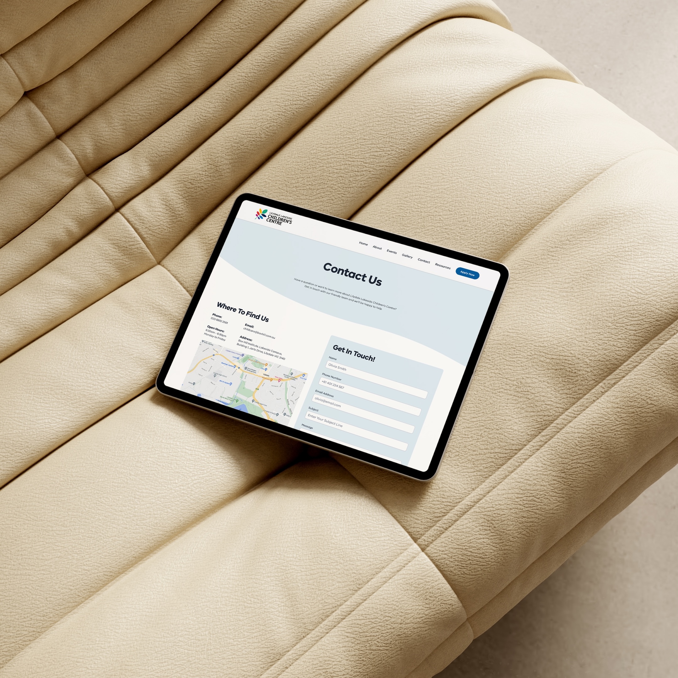
The website included information about the centre, its philosophy and vision, individual room profiles, educator information, upcoming events, image galleries, menus and nutrition, frequently asked questions, policies and procedures, app resources, contact details and more.
Each area was structured around the type of information families needed to access, helping prevent the website from becoming an overwhelming collection of disconnected pages.
This also allowed content-heavy areas — such as policies, room information and parent resources — to remain easy to scan and navigate.
Room Profiles & Educator Information
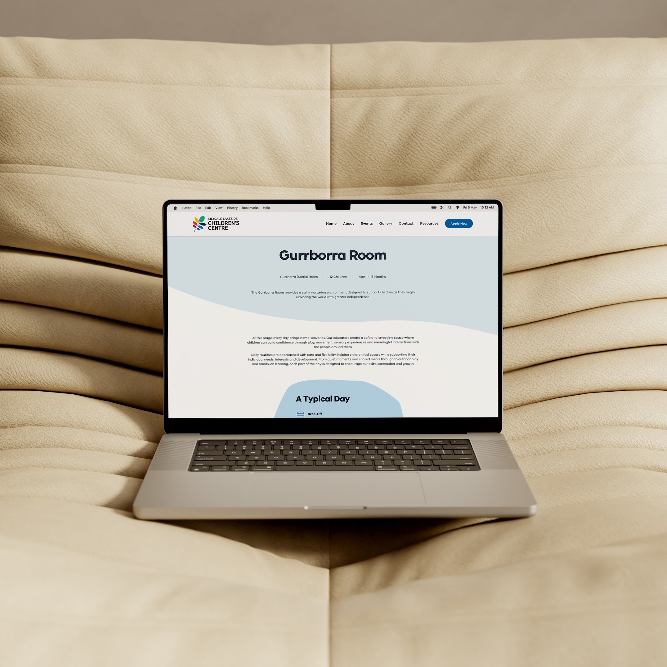
Dedicated room pages were created to give families a clearer understanding of each learning environment within the centre.
Each page followed a consistent structure, bringing together room information, a typical daily routine, imagery and educator profiles within a simple and approachable layout.
This gave prospective families a more detailed view of the centre while also helping existing families quickly access information relevant to their child’s room.
Using a repeatable page structure also created consistency across the website and made the content easier to manage within WordPress.
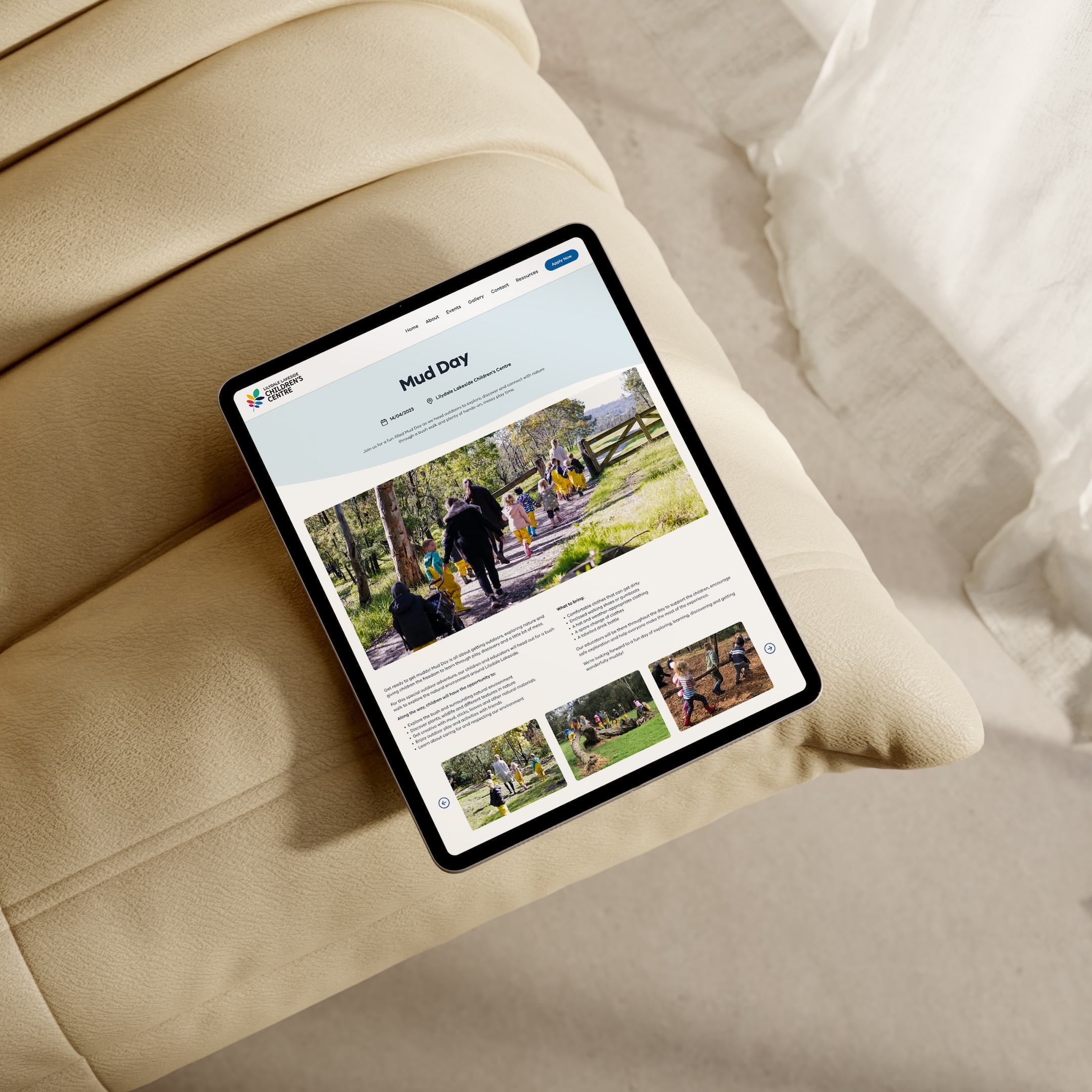
Events & Community Information
The website included a dedicated events system designed to keep families informed about what was happening within the centre.
A calendar-style events page provided an overview of upcoming activity, while individual event pages allowed more detailed information, imagery and event-specific content to be published when required.
This created a clearer way for families to stay connected with the centre community while keeping event information separate from more permanent website content.
Practical Resources for Families
Beyond the core centre information, the website also brought together a range of practical resources used by families.
Dedicated areas included frequently asked questions, policies and procedures, menus and nutrition information, the Xplor Home App, childcare subsidy resources and other useful information for parents.
These areas were designed around usability rather than decoration, with clear layouts and straightforward navigation helping visitors move quickly to the information they needed.
Interactive elements such as expandable FAQs and structured policy navigation also helped make more detailed content easier to digest.
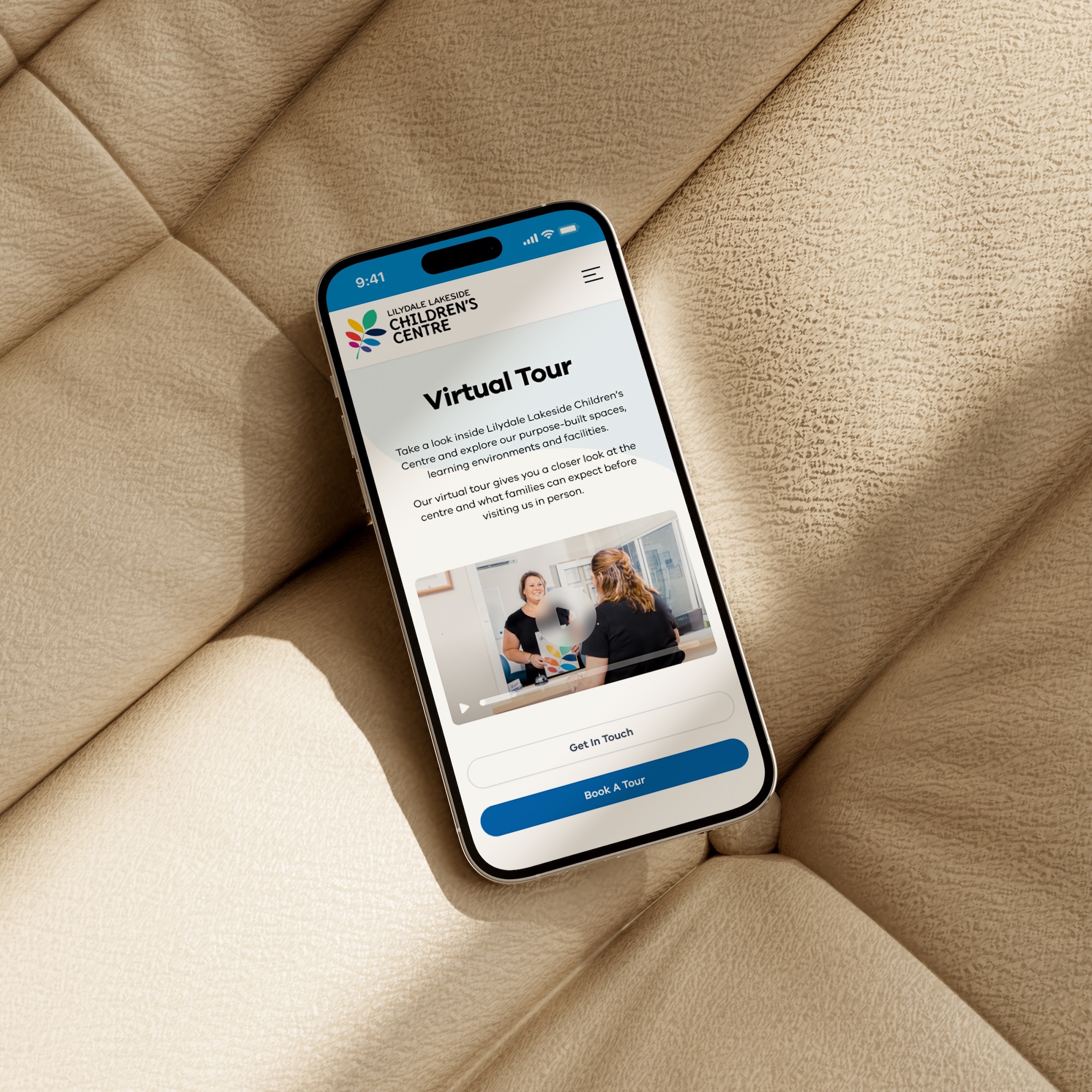
Virtual Tour & Visual Content
Photography played an important role throughout the website, helping prospective families gain a stronger sense of the centre, its rooms and learning environment.
A dedicated Virtual Tour page provided another way for families to explore the centre before visiting in person, while image galleries were used throughout room, event and general information pages.
This visual content helped balance the more practical and information-heavy areas of the site, giving the experience a stronger sense of warmth and personality.
WordPress Content Management
Behind the front-end experience, the website was developed on WordPress to provide a flexible and structured foundation for ongoing content management.
With numerous content types across the site, consistency within the CMS was important.
Repeatable templates and content structures were used across areas such as rooms and events, allowing similar information to follow a consistent format while still giving each page its own content and imagery.
This helped bring a large amount of information together within one cohesive system and made ongoing updates more manageable for the centre.
Responsive Design Across Devices
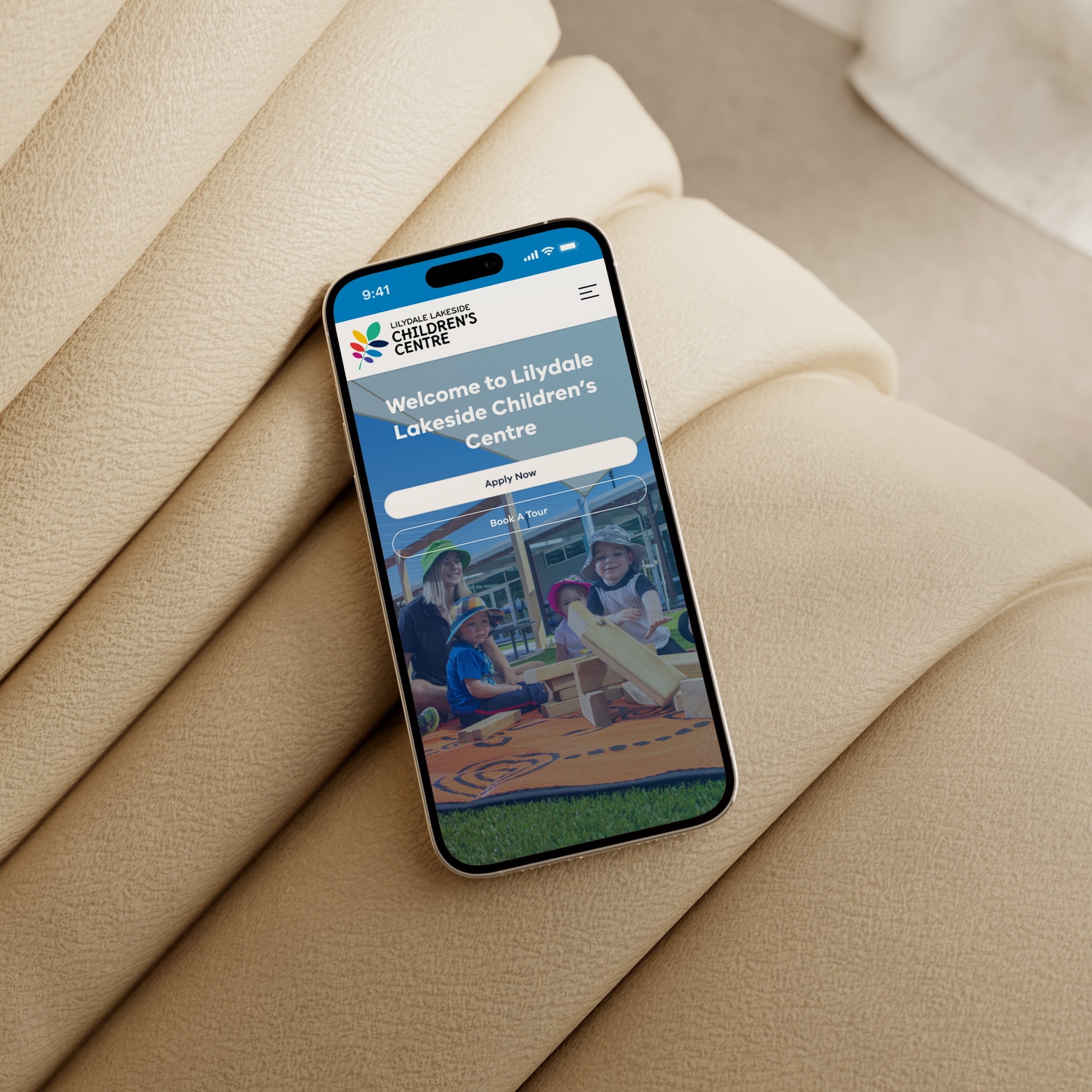
The website was designed to work seamlessly across desktop, tablet and mobile devices.
For parents and families, mobile usability was particularly important. Visitors may need to quickly check an event, access a policy, find contact information or review centre details while away from a computer.
Layouts, imagery, navigation and interactive elements were therefore considered across different screen sizes to ensure the experience remained clear, readable and easy to navigate wherever the site was being accessed.
The Outcome
The completed website gave Lilydale Lakeside Children’s Centre a warm, modern and practical digital platform that brought a substantial amount of information together within one cohesive experience.
The visual direction created an engaging and recognisable personality, while the underlying content structure made important information easier for families to access.
From individual room profiles and educator information through to events, policies, menus, FAQs, galleries and parent resources, the site was designed around the different ways families interacted with the centre online.
For us, the project remains a strong example of how thoughtful website design and structured content management can turn a complex, information-rich brief into an experience that feels simple, welcoming and easy to use.
Lilydale Lakeside Children’s Centre remains a project we’re proud to include in our portfolio because it demonstrates how a content-rich website can still feel simple, welcoming and full of personality.
There was a significant amount of information that needed to live within the site, but the experience couldn’t feel clinical or overwhelming. It needed to reflect the warmth of an early learning environment while making everyday information genuinely easy for families to access.
We particularly enjoyed developing the visual system for the project. The combination of soft organic forms, pale blue backgrounds, strong typography and colourful photography created a distinctive look that felt playful without losing clarity or professionalism.
The project also gave us the opportunity to build a wide range of structured content within WordPress. From individual room pages and educator profiles through to events, policies, menus, FAQs and parent resources, each area needed its own purpose while still feeling like part of the same website.
While Lilydale Lakeside Children’s Centre has since transitioned under new ownership and no longer operates under this name, the project remains a great example of our approach to creating thoughtful, structured digital experiences for education and early learning communities.