A warm, approachable brand identity for a new local cleaning business
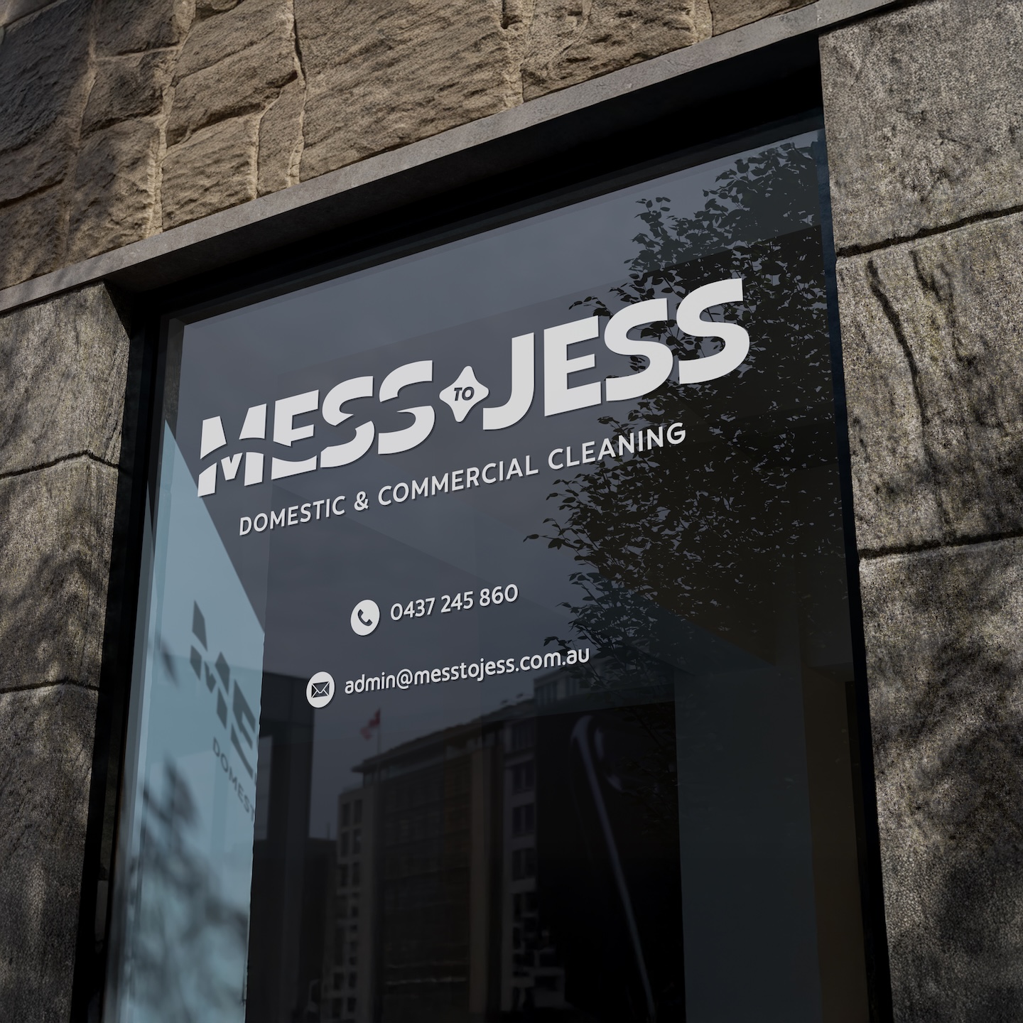
For Mess To Jess, we created a warm and approachable brand identity that captures the professionalism, care, and attention to detail behind the new cleaning business, helping it launch with confidence and stand out in the regional market.
Mess To Jess is a newly established cleaning business in rural Victoria, created to deliver reliable, detail-driven domestic cleaning across Benalla and the surrounding region. As a new brand entering a competitive local market, Jess needed a visual identity that felt trustworthy and professional, while still warm, friendly, and approachable for everyday homeowners.
Spacey Studios partnered with Jess to develop a brand identity that captures the core promise behind the name itself: a simple, satisfying transformation from “mess” to clean. The result is a bold, memorable identity system built for real-world use across uniforms, business cards, social media, and a future website presence.
The Challenge
Starting from scratch meant there was no existing brand recognition, visual system, or collateral to build from. The key challenge was creating a logo and supporting identity that:
Builds trust quickly in a local community
Feels friendly and down-to-earth, not corporate
Stands out from generic cleaning branding
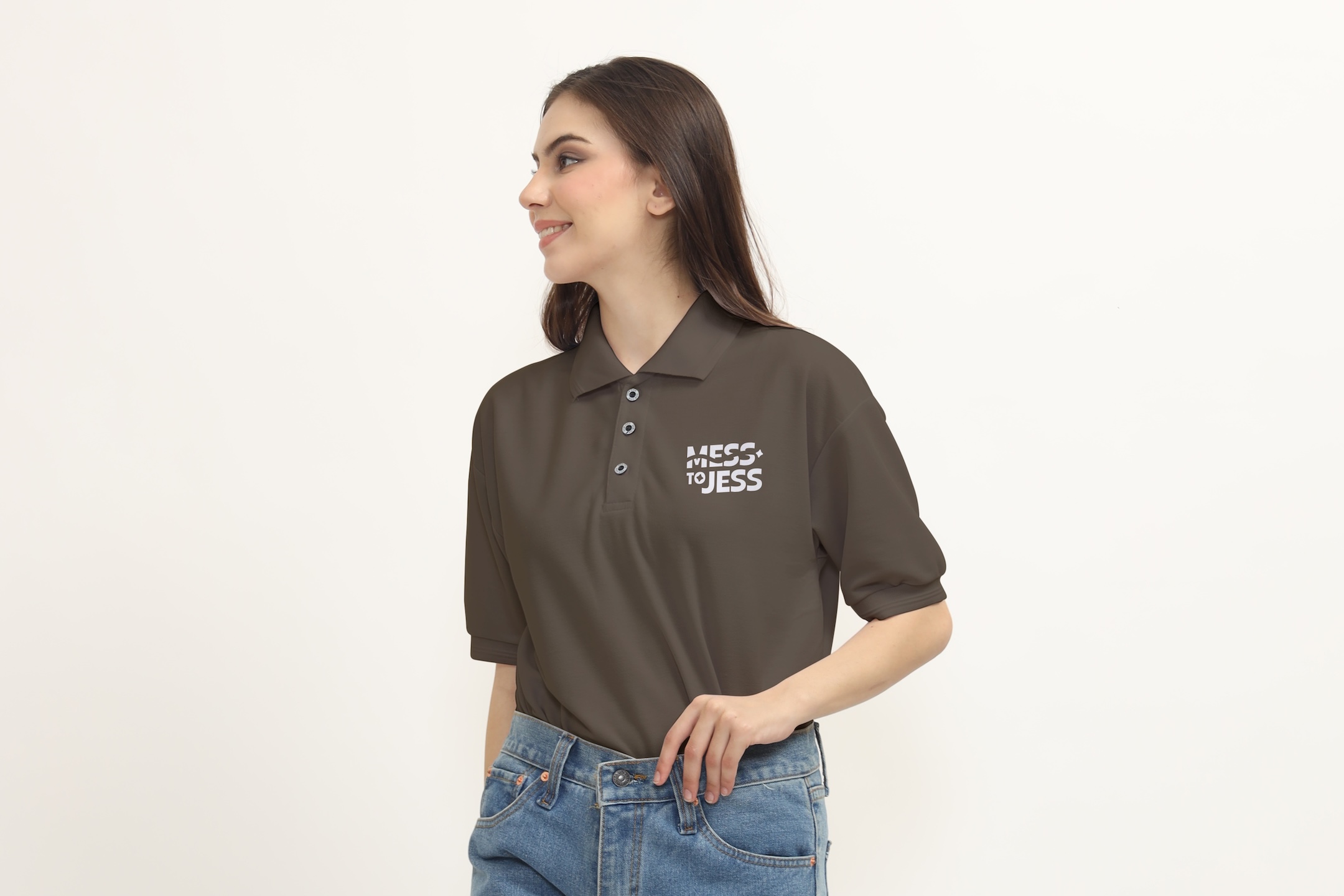
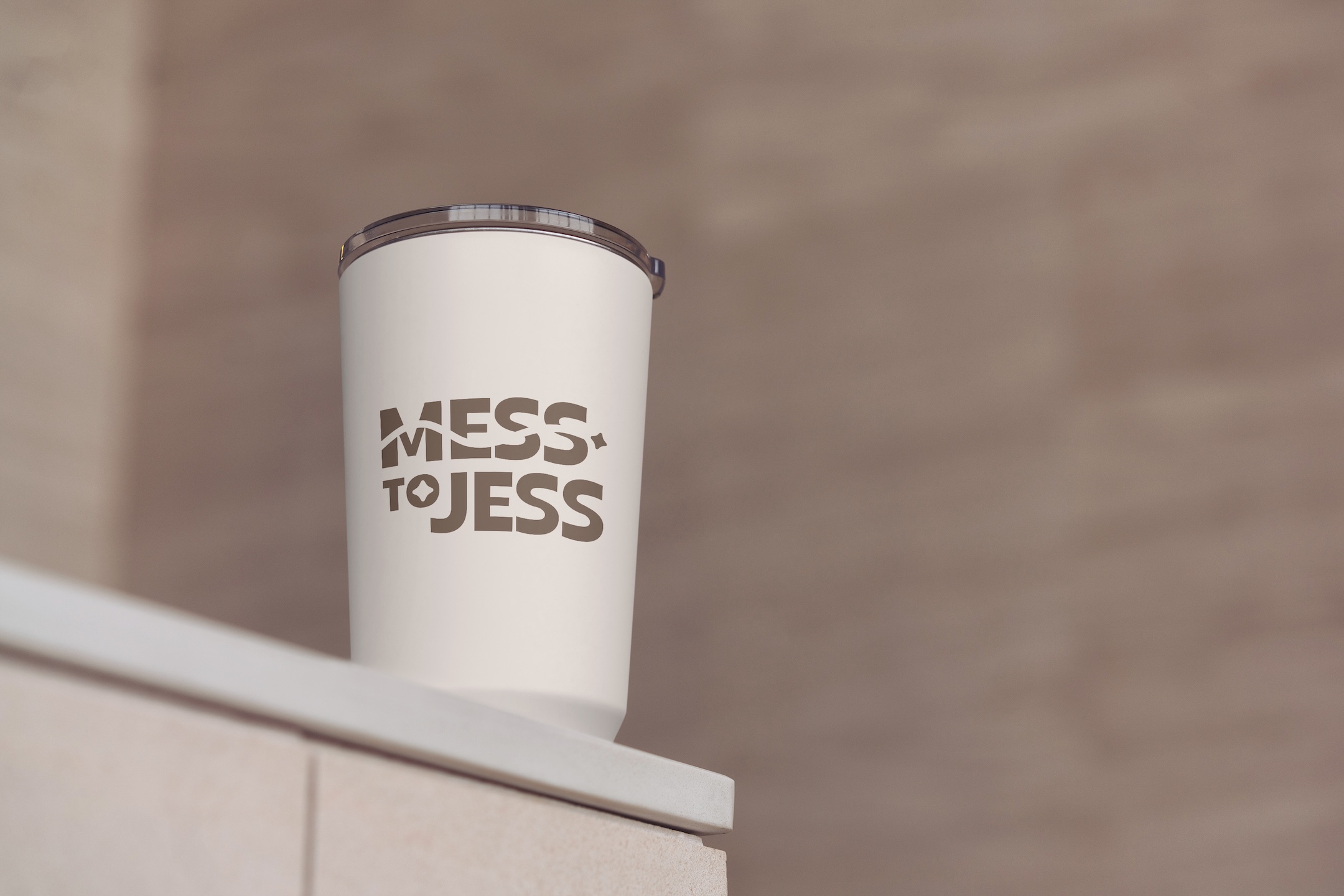
Works across a wide range of applications (uniforms, drink bottles, signage, social media)
Remains simple and effective in one colour, but flexible enough to support colour expansion
Our Approach
We began with discovery and creative direction, focusing on positioning Mess To Jess as a dependable local service that people recommend with confidence. From there, we explored multiple logo concepts that each expressed “transformation” in a different way — including typography-led directions, wipe-through/cleaning-inspired layouts, and icon-based variations.
Through concept presentation and client feedback, we identified the strongest elements:
the visual story of “messy to clean”
a subtle spark element that adds personality and polish
This direction evolved into a refined hybrid concept that balanced both — keeping the transformation narrative while introducing a distinctive brand mark that feels confident, memorable, and recognisably “Mess To Jess”.
The Solution
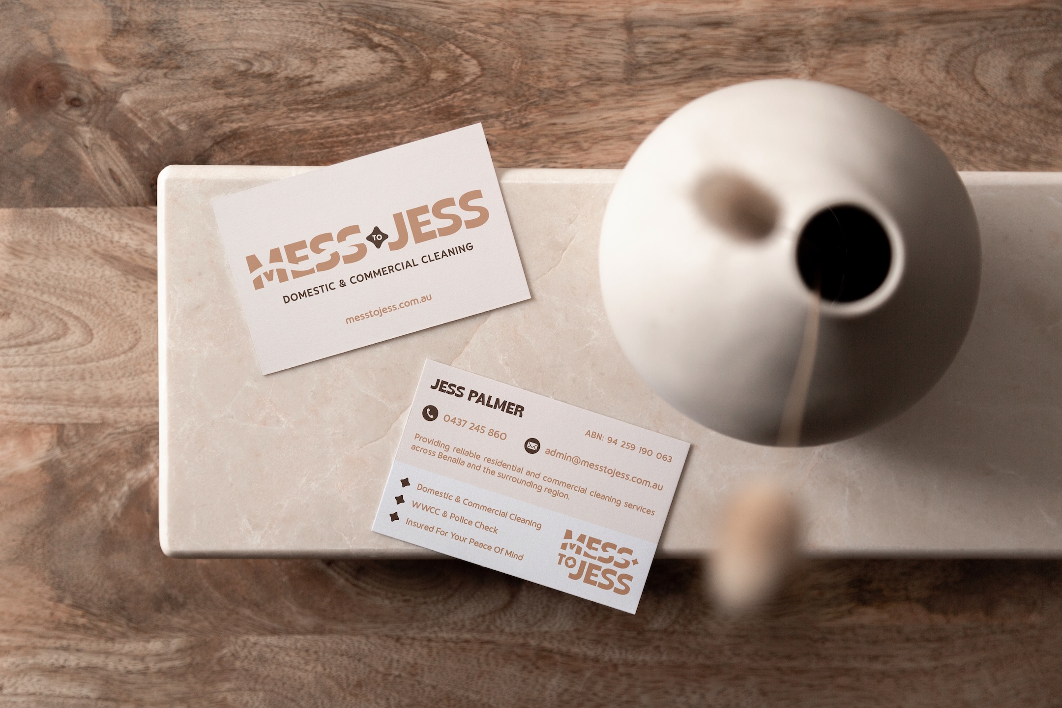
The final identity centres on a bold wordmark that visually communicates the brand story in a single glance. The design system was then expanded into multiple lockups to ensure flexibility across formats — from horizontal and stacked arrangements through to simplified versions for smaller placements.
Following logo approval, we explored colour palettes designed to suit Jess’s preferences (neutral tones and strong black-and-white), while also offering bolder options to help the brand stand out in-market. Each palette was tested across the full set of logo lockups to ensure consistency and legibility.
The Deliverables
Logo design exploration (multiple concepts + refinements)
Final selected logo with complete lockup set (primary, secondary, stacked, simplified, brand mark)
Monochrome-ready identity suited to uniforms and print applications
Colour palette exploration (multiple directions)
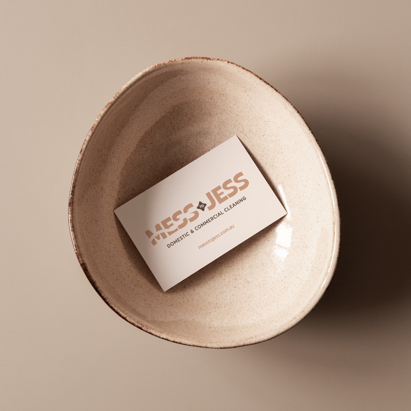
Business card design
Social media story templates and promotional graphics
Outcome
Mess To Jess now has a strong, memorable brand foundation to support launch and growth in the Benalla region. The identity is simple, practical, and versatile — designed to work everywhere Jess needs it, from uniforms and business cards through to ongoing social media promotion and a future website presence.
With the brand identity now established, the next phase of this project is to focus on building a clean, easy-to-navigate website to support enquiries and inform customers about the Mess To Jess service offering.
Reflection
This project was a great opportunity to step outside the expected and explore a more creative, human approach to a traditionally functional industry. Rather than leaning into the typical visual language of cleaning businesses, we intentionally crafted a brand that felt warm, personable, and inviting — something that better reflects the trust required when welcoming a service into your home.
By embracing a more character-driven identity, we were able to position Mess to Jess as approachable and genuine, rather than corporate or transactional. This approach highlights the value of leaning into small business personality as a strength — building stronger emotional connection, familiarity, and ultimately, trust with the end customer.
It’s a reminder that effective branding isn’t about following industry norms, but about understanding the experience you want to create — and designing something that feels true to both the business and the people it serves.