Turning complex property data into engaging internal communications
Domain Group is one of Australia’s leading real estate platforms, helping buyers, sellers, renters, and investors navigate the property market through data, insights, and digital tools.
We were engaged by Domain Group’s Research & Insights team to support the design of internal reporting materials for a national conference and broader consumer insights rollout. The goal was to take detailed consumer survey data and market research, and transform it into something clear, engaging, and easy for internal teams to absorb.
Rather than presenting the insights through a standard corporate report, Domain wanted something more memorable — a format that would stand out, spark conversation, and help teams across sales, marketing, and research connect with the data in a more meaningful way.
The Challenge
The project involved a large amount of complex consumer data, covering different property market segments, buyer behaviours, and audience insights.
The challenge was to make this information feel accessible without oversimplifying it. Each piece of collateral needed to present data clearly, follow Domain Group’s established brand guidelines, and support internal teams with practical, easy-to-digest insights.
There was also a logistical challenge. For the conference, the tabloid-style reports needed to be designed, printed, and delivered to Domain Group’s offices across Australia within a quick turnaround — ensuring the relevant teams received the materials on the same day.
This required a careful balance of design, production management, and coordination.
The Approach
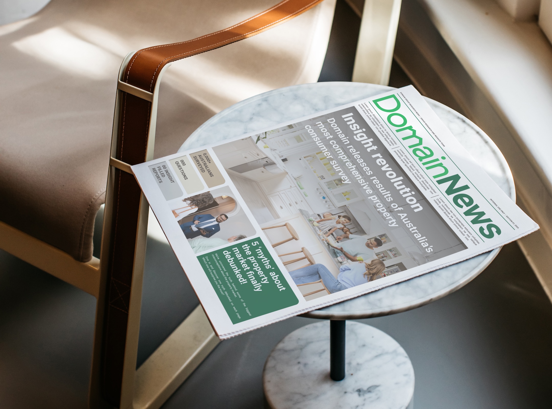
We developed a creative old-school tabloid-style report as the centrepiece of the project.
This format gave the research a fresh and unexpected presentation style, moving away from traditional corporate reporting and into something more tactile, editorial, and engaging. The tabloid approach created a stronger sense of occasion for the internal conference, while making the content feel easier to browse, share, and discuss.
Our design direction focused on clear storytelling, bold visual hierarchy, and structured data presentation. Each section was designed to help the reader quickly understand the key message, while still giving enough detail to support deeper internal discussion.
Alongside the tabloid report, we designed a suite of consumer segment presentation decks. These reports explored different audience groups and property segments, translating detailed research into polished, brand-aligned presentation materials.
Across more than 12 reports, we ensured every graph, chart, statistic, and layout felt consistent, accessible, and aligned with Domain Group’s visual identity.
Design & Data Visualisation
A key part of this project was bringing structure to complexity.
Consumer research can quickly become overwhelming when presented without clear hierarchy. Our role was to help shape the information into layouts that guided the reader through the insights, rather than asking them to decode raw data on their own.
We carefully considered:
- How charts and graphs should be structured
- Where key statistics needed stronger emphasis
- How to create clear section breaks and reading flow
- How to keep each report visually engaging without distracting from the data
- How to maintain brand consistency across a large suite of materials
The result was a suite of collateral that felt polished, cohesive, and strategically useful — supporting Domain Group’s internal teams with insights they could understand, share, and act on.
Print & Logistics
In addition to the design work, we assisted with the print production and logistics for the tabloid reports.
With a fast turnaround and national delivery requirements, the production process needed to be carefully managed from final artwork through to distribution. We coordinated the print process and helped ensure the finished tabloids were delivered to the relevant teams across Domain Group’s offices around Australia on the same day.
This added an important layer to the project. It wasn’t just about creating something that looked good on screen — it needed to work as a physical communication piece, produced at quality, delivered on time, and ready to support the conference experience.
The Outcome
The final deliverables gave Domain Group a more engaging way to share important consumer insights internally.
The tabloid-style report created a memorable, tactile format for the national conference, while the consumer segment decks provided a broader suite of structured insights for sales, marketing, and research teams.
By combining editorial-inspired print design with modern data visualisation, we helped turn complex research into materials that were clear, compelling, and easy to navigate.
The project showed how thoughtful graphic design can elevate internal communications — transforming data from something purely informational into something people actually want to engage with.
Key Deliverables
- Tabloid-style internal market report
- Consumer segment presentation decks
- Design support across 12+ detailed reports
- Data visualisation and chart styling
- Brand-aligned report layout design
- Print artwork preparation
- Print production support
- National delivery and logistics coordination