Bringing the iconic Noodle golf ball back to the Australian market
We designed the packaging for the Australian relaunch of the iconic Maxfli Noodle golf balls, creating two distinct product variants, recreating the classic Noodle wordmark, and preparing production-ready artwork across the packaging and golf ball decals.
The House of Golf approached Spacey Studios ahead of the Australian relaunch of Maxfli Noodle — an iconic golf ball range returning to market in two variations: the classic white Noodle and a new Multicolour Graffiti edition.
Working within the established Maxfli packaging system, we developed a refreshed packaging direction that reintroduced the distinctive personality of Noodle while remaining cohesive with the broader Maxfli range. From recreating the original Noodle wordmark through to final production artwork, packaging separations and golf ball decals, the project brought the range together across every physical touchpoint.
The Challenge
Reviving Noodle without losing its identity.
The challenge was to bring Noodle back to market as a recognisable part of the Maxfli family, while giving the product enough personality to stand apart on the shelf.
Rather than starting with a blank canvas, we worked from Maxfli’s existing Softfli packaging architecture. Key structural elements and visual cues needed to remain consistent with the wider product range, while the branding, colour palette and graphic treatments were adapted to establish a distinctly Noodle look and feel.
There was also an important piece of brand history to preserve. The original Noodle wordmark wasn’t available as usable vector artwork, requiring us to carefully reconstruct it from historical references before it could be incorporated into the new packaging system.
With a factory production deadline approaching at the end of May, the entire process needed to move quickly from initial artwork setup through design, refinement and final production files. The original project programme allowed approximately two weeks from commencement to final artwork handover.
The Approach
Building on Maxfli. Bringing back Noodle.
Our approach centred on finding the right balance between brand consistency and product personality.
The underlying Maxfli packaging structure provided a recognisable foundation across the range, including its strong diagonal composition, oversized golf ball imagery and technical product information. We retained this framework while introducing the distinctive Noodle identity through typography, colour and graphic treatments.
The original Noodle wordmark was carefully recreated in vector format from historical packaging references, preserving its familiar hand-drawn character while creating a clean, production-ready asset that could be used across the new range and into the future.
From there, we developed two related but distinctly different packaging executions.
Two products. One cohesive range.
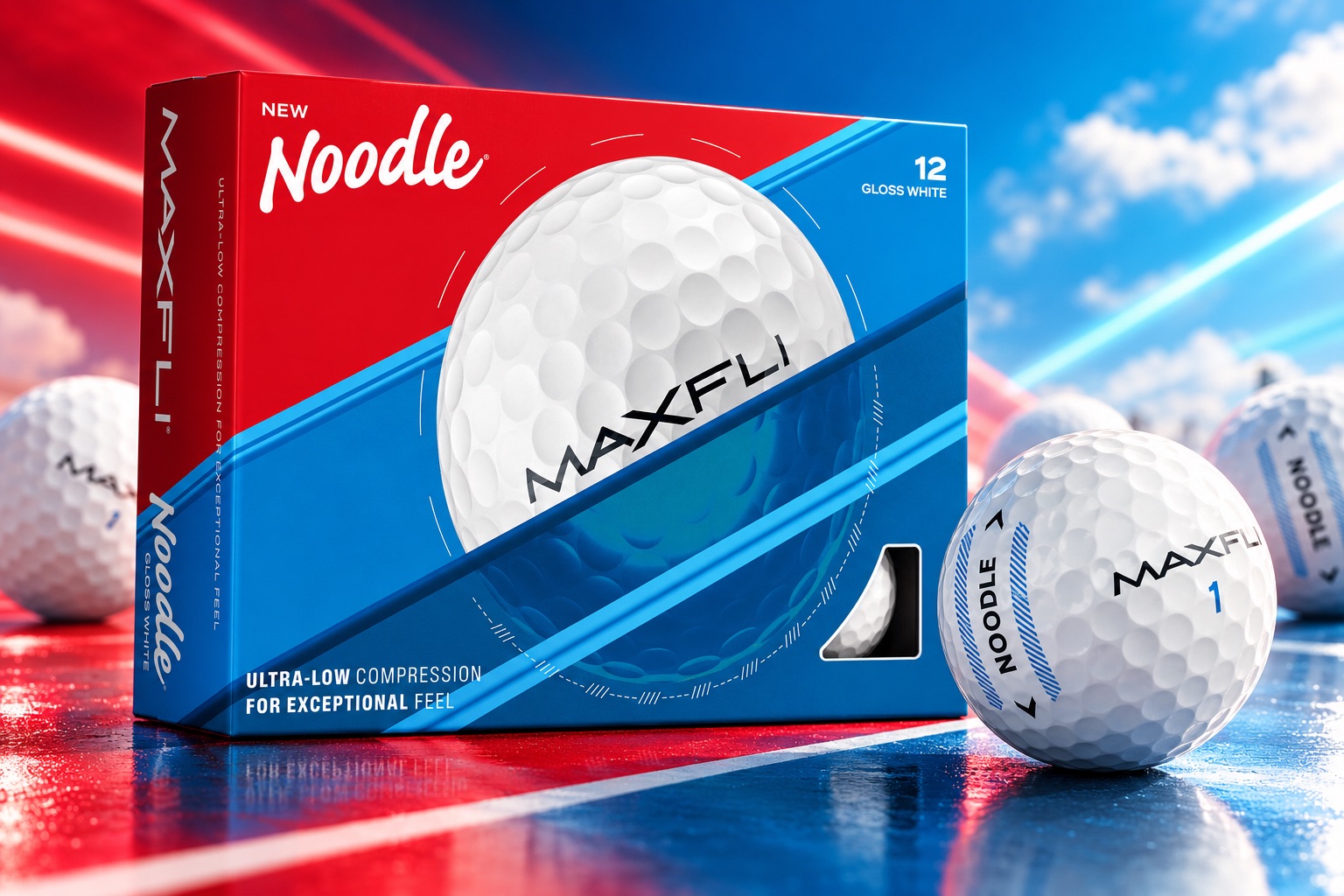
Noodle Gloss White
For the core white golf ball, we developed a cleaner interpretation of the Noodle identity built around a bold red, white and blue palette.
The vibrant red upper panel gives the Noodle wordmark a strong presence, while the layered blues connect the packaging back to the established Maxfli visual language. The result feels familiar to existing Noodle customers without appearing dated — balancing the nostalgic character of the product with a contemporary retail presentation.
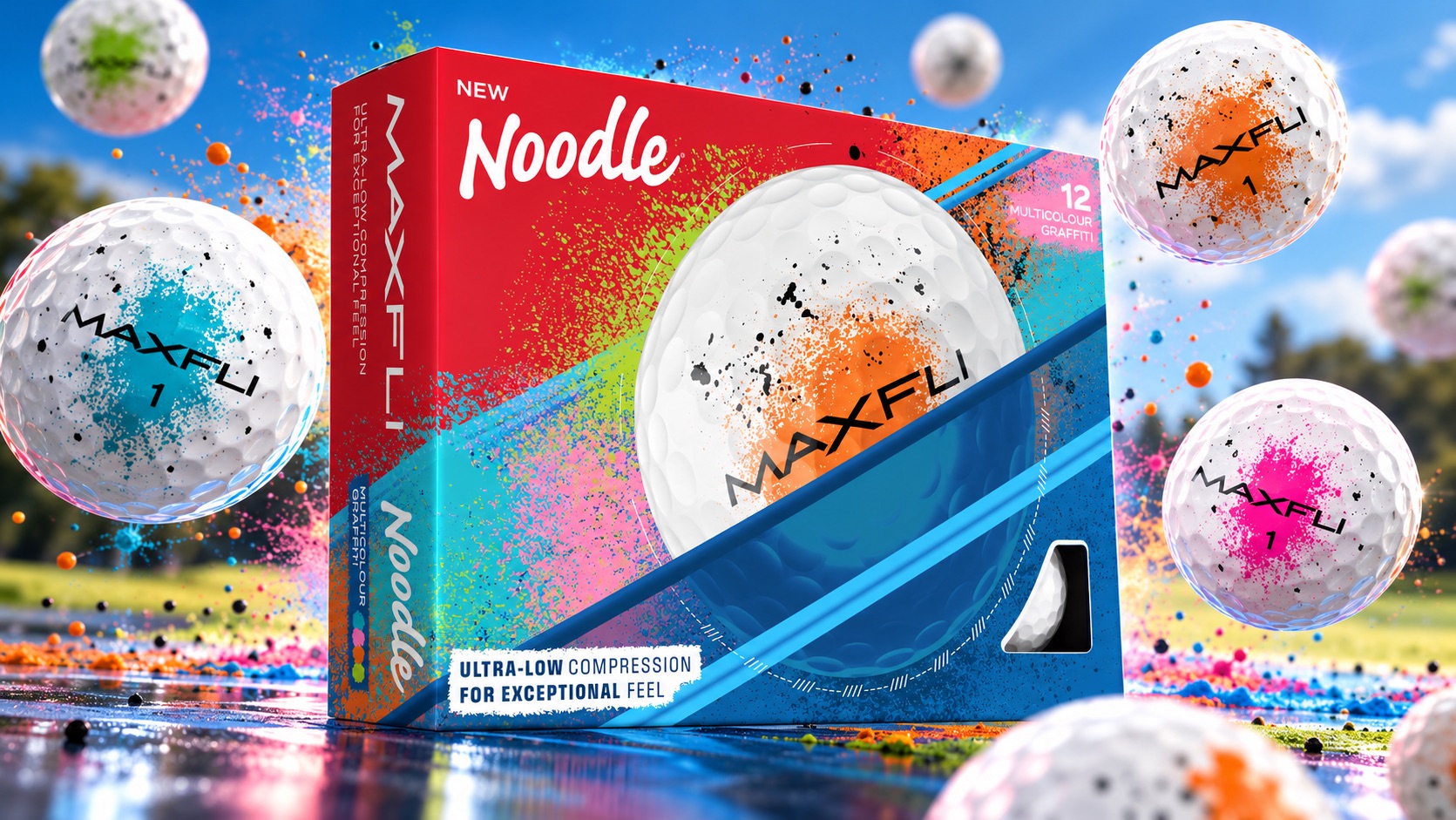
Noodle Multicolour Graffiti
The Multicolour Graffiti variant gave us an opportunity to push the system further.
Building on the same underlying packaging architecture, bursts of orange, green, cyan, pink and black reference the paint-splattered finish of the golf balls themselves. The expressive graphic treatment extends across the pack while retaining the core red and blue structure, allowing the Graffiti edition to feel much more energetic without becoming disconnected from the standard Noodle product.
Together, the two SKUs create a recognisable family: one clean and classic, the other colourful and expressive.
From Concept to Production
Designed for the shelf. Built for manufacturing.
Packaging design doesn’t finish when the front of the box looks right.
Following approval of the creative direction, we worked through the complete artwork system required to bring the products into production. This included refining artwork across the external packaging, internal boxes and individual golf ball decals, ensuring the Noodle identity remained consistent at every level of the product experience.
We liaised with the manufacturer throughout the final artwork process, responding to production requirements and preparing the required artwork separation layers for manufacturing. Files were checked and refined for production before final approval and handover.
This technical stage was particularly important for the Multicolour Graffiti edition, where the energetic visual treatment needed to translate accurately from the digital artwork into the physical printed product.
The result was a complete, production-ready packaging system rather than simply a set of packaging concepts.
The Outcome
An icon, reintroduced.
The finished range brings Noodle back to the Australian market with an identity that feels both familiar and refreshed.
By combining the established visual architecture of Maxfli with Noodle’s more playful personality, the packaging creates a clear relationship with the wider product family while giving Noodle its own distinctive presence.
Across the classic Gloss White and expressive Multicolour Graffiti editions, the final system carries consistently from the outer retail packaging through to the internal boxes and golf balls themselves — creating a cohesive product experience ready for manufacture and retail.
The iconic Noodle is back.
Reflection
Bringing Maxfli Noodle back to the Australian market was a particularly rewarding packaging project for us, especially given the history and recognition already attached to the Noodle name.
Rather than creating something entirely new, the challenge was to respect that legacy while giving the range a refreshed identity that felt at home alongside the broader Maxfli product family. Recreating the classic Noodle wordmark and finding the right balance between its distinctive personality and Maxfli’s established packaging system were important parts of getting that right.
The project also moved incredibly quickly. With a factory production deadline approaching, we progressed from initial artwork setup and wordmark recreation through to two complete packaging variants and production-ready artwork within a very condensed timeframe.
Packaging projects demand a high level of attention to detail at the best of times, and this was no exception. Beyond the visual design, we worked through manufacturer requirements, artwork separations, internal and external packaging, and golf ball decals to ensure every component was consistent and ready for production.
We’re particularly proud of how the two variants work together. The Gloss White edition feels clean and recognisably Noodle, while the Multicolour Graffiti edition introduces a much more expressive personality without losing its connection to the wider range.
For us, the project is a great example of how thoughtful packaging design can evolve an established product without losing what made it recognisable in the first place — and how a considered, production-focused process can still deliver a strong creative outcome under a tight deadline.