A defining new chapter for an established Australian law firm
We partnered with Leap Studios to reimagine the brand and digital presence of Eventus Lawyers, formerly SLF Lawyers, creating a distinctive visual identity and contemporary website that reflect the firm’s evolution, expertise and ambitions for the future.
Eventus Lawyers is an established Australian law firm with a growing national presence and expertise across a broad range of legal disciplines.
Previously known as SLF Lawyers, the firm had reached an important point in its evolution. Its capabilities, culture and ambitions had grown beyond what its existing brand communicated, creating an opportunity to establish an identity that better reflected the organisation it had become.
From the initial research and creative direction through to brand guidelines, corporate collateral and a new Webflow website, the project was about more than changing how the firm looked. It was about establishing a consistent, contemporary presence that could support its continued growth.
The Challenge
Evolving an established reputation
Rebranding an established law firm comes with a particular set of challenges.
SLF Lawyers had built a strong reputation, trusted client relationships and recognition across its key markets. While the business was ready for a new identity, it was important that the transition didn’t create uncertainty around the people, expertise and relationships already associated with the firm.
The new brand needed to represent a modern, multidisciplinary legal practice while retaining the credibility expected of an established firm.
There was also an opportunity to stand apart in a traditionally conservative industry.
Many law firms rely on familiar visual conventions and similar messaging around professionalism and trust. We wanted to create something distinctive without losing the sense of confidence and authority that clients expect when seeking legal advice.
The challenge extended into the website, which needed to bring together the firm’s extensive services, people, industry expertise and locations in a way that was clear, accessible and easy to navigate.
Ultimately, the goal was to create a brand and digital experience that felt like a natural progression for the business, rather than a departure from its established reputation.
Brand Strategy
Finding clarity through complexity
We began with an extensive discovery and research process, exploring the firm’s existing positioning, competitive environment, internal culture and ambitions for the future.
Through stakeholder discussions and strategic development, we identified several qualities that needed to come together within the new brand: established expertise, commercial understanding, progressive thinking and a genuinely approachable personality.
The name Eventus, associated with outcomes and results, provided an important starting point.
Rather than focusing exclusively on legal expertise, we explored the role the firm plays in helping clients navigate complex situations, consider different perspectives and work towards a clear outcome.
This thinking led to a central creative direction: clarity through complexity.
Legal matters often involve competing priorities, multiple considerations and no immediately obvious path forward. Eventus Lawyers brings together the expertise and perspective needed to make sense of those challenges.
This idea became the foundation for the visual identity, influencing everything from the logo concept to the broader brand system and website experience.
Brand Identity
Different perspectives. One point of resolution.
The central idea behind the Eventus Lawyers identity is convergence.
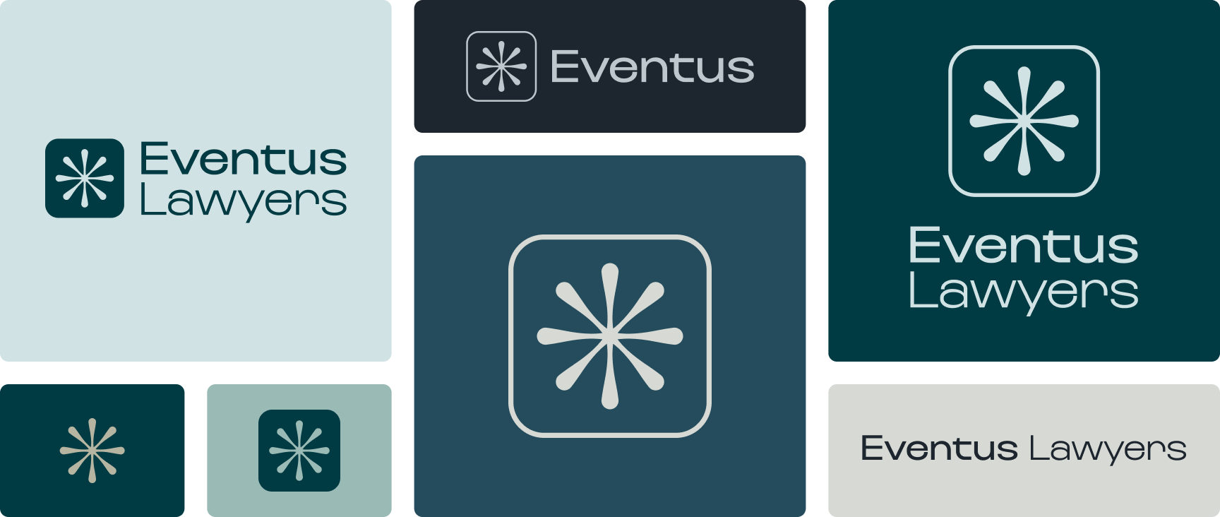
We developed a distinctive geometric symbol representing different paths and perspectives coming together around a central point of resolution.
Eight directional forms extend from the centre of the mark, creating a connection to the firm’s eight practice groups while suggesting movement, alignment and strategic thinking.
The symbol can be interpreted in several ways: an intersection, a target, a point of clarity or multiple areas of expertise working towards a shared outcome.
This gave us a meaningful visual concept that connected directly to the firm’s positioning, without relying on conventional legal imagery such as scales, pillars or gavels.
The symbol was paired with a refined wordmark and a visual language designed to feel contemporary, confident and professional.
Colour, typography and visual expression
The colour palette combines deep teal and graphite, supported by a range of lighter and warmer neutral tones.
Teal gives the brand a distinctive, contemporary character, while graphite introduces depth and authority. The supporting colours provide flexibility across everything from expressive brand communications to formal corporate materials.
Instrument Sans was selected as the primary typeface, bringing a clean, contemporary character to the identity without feeling overly formal or traditional. Its refined letterforms and versatile range of weights allow us to create confident, expressive headlines while maintaining clarity and legibility across more detailed content. This balance was particularly important for a legal firm, where typography needs to communicate professionalism while remaining approachable and easy to read.
Together, the geometric symbol, considered typography and restrained colour palette establish a recognisable identity that feels appropriate for an established legal firm without following the industry’s more traditional conventions.
The result is a flexible visual system that can be expressed consistently across print, digital and everyday communications.
Brand Guidelines & Applications
Bringing the identity into everyday practice
Developing the identity was only one part of the challenge. It also needed to work across a large organisation, where much of the brand’s everyday presence would be experienced through documents, correspondence and professional communications.
We created a comprehensive Brand Standards document that brought together the firm’s positioning, personality, communication principles and visual identity.
Importantly, the guidelines were designed to be practical and accessible for people without a background in design.
Rather than simply documenting colours and logo specifications, they provide clear guidance on how the brand should be applied consistently across different situations.
We also extended the identity into a range of corporate applications, including business cards, letterheads, Microsoft Word templates, email marketing templates, branded notepads and supporting collateral.
Each application was developed with the same emphasis on clarity, consistency and practicality.
The aim was to give Eventus Lawyers a complete brand system that could be confidently adopted across the organisation, rather than a collection of individual design assets.
Website Design & Development
Making legal expertise easier to discover
The website was another major component of the transformation.
Eventus Lawyers needed a digital presence that could communicate the breadth of its expertise while making it straightforward for visitors to find relevant services, lawyers and information.
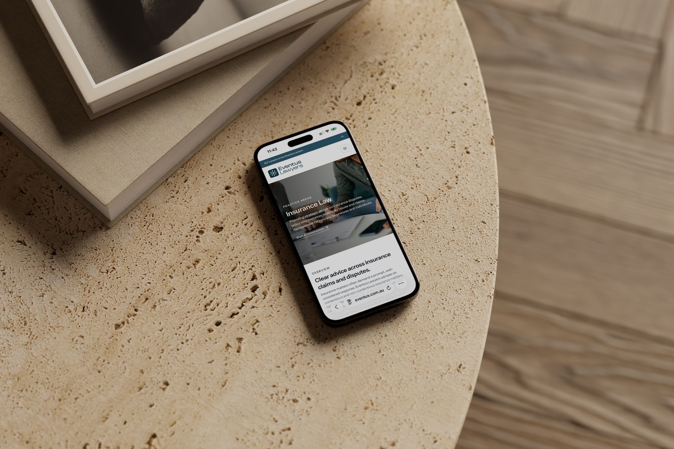
We designed and developed a bespoke Webflow website spanning more than 60 pages, with a strong focus on user experience, content discovery and long-term flexibility.
A clearer way to navigate legal services
One of the most important decisions was to organise the website around the information visitors were most likely to need.
Practice areas became a primary navigation pathway, supported by lawyer profiles, industry sectors, insights and office information.
Rather than treating these as separate sections, we developed an interconnected structure that helps visitors move naturally between related content.
Someone exploring a particular legal service can discover the lawyers associated with that area, while individual profiles connect back to relevant services and expertise.
This approach makes it easier for visitors to find the right information without needing to understand the firm’s internal structure.
The visual design follows the same principles of clarity and restraint established through the brand identity.
Confident typography, generous spacing and considered use of colour create a contemporary experience without distracting from the content.
Accessibility and usability were also important considerations, particularly given the wide range of people who may need to engage with legal services.
We prioritised clear navigation, readable content, familiar interface behaviours and subtle interactions that support the experience rather than complicate it.
A connected Webflow CMS
Behind the website is a structured Webflow CMS designed to manage the firm’s extensive content efficiently.
Lawyers, practice areas, industry sectors and insights are connected through dynamic relationships, allowing relevant information to appear throughout the website without needing to be maintained separately on every page.
We also developed custom functionality, including a people filtering system and downloadable contact cards for individual lawyer profiles.
These features were supported by targeted CSS and JavaScript development, extending Webflow’s native capabilities where required.
The result is a bespoke website that balances a refined front-end experience with a practical, scalable content management system.
SEO & Website Migration
Supporting the transition to Eventus Lawyers
The rebrand also involved transitioning the firm’s digital presence from the SLF Lawyers domain to Eventus Lawyers.
This required careful coordination to ensure existing visitors could find the new website and understand the change.
Working with the firm’s IT provider, we implemented a custom permanent redirect solution using AWS CloudFront, directing visitors from the previous domain to a dedicated transition page explaining the rebrand.
Together, these measures supported the domain transition while establishing the technical infrastructure for ongoing search visibility and performance monitoring.
A Collaborative Approach
Bringing the project together
The Eventus Lawyers transformation was delivered through a close collaboration between Spacey Studios and Leap Studios, working alongside the firm’s senior management team.
Leap Studios was the lead agency for the engagement, bringing the project together and engaging Spacey Studios as its creative and digital partner to lead the brand strategy, visual identity and website design and development.
Leap contributed throughout the discovery and strategy phases while managing the client relationship, overall project coordination and stakeholder communications. As the primary point of contact for Eventus Lawyers, they facilitated meetings, presented work and gathered feedback on behalf of the broader project team, coordinating approvals and keeping the various stages of the project moving forward.
A particularly significant part of their contribution was managing the project’s extensive content and photography requirements.
With more than 50 staff members requiring professional headshots, alongside the substantial volume of website copy, supporting imagery and business information needed across the site, gathering and preparing the content was a major undertaking.
Leap coordinated the photography, image editing and preparation, developed the website copy, sourced supporting imagery and worked closely with stakeholders across the firm to gather, review and organise the content required for implementation.
They also played an active role in the creative process, contributing ideas and feedback throughout the brand identity and website design stages. This included brainstorming and workshopping creative directions, reviewing design concepts and helping refine ideas as the project progressed.
Beyond the creative work, Leap coordinated the production, distribution and broader rollout of the new brand collateral.
The collaboration brought together complementary expertise, with both studios contributing to a coordinated transformation across the firm’s brand, digital presence and everyday communications.
The Outcome
A brand built for what comes next
The transition from SLF Lawyers to Eventus Lawyers represents a significant evolution in how the firm presents itself.
The new identity provides a distinctive and consistent visual language that reflects the firm’s expertise, culture and future direction.
Supported by comprehensive brand guidelines and practical corporate applications, it establishes a system that can be used confidently across the organisation.
The website brings that identity into a digital environment, providing clearer pathways to the firm’s services, people and insights through a flexible, interconnected platform.
Together, the brand and website establish a more cohesive presence for Eventus Lawyers, bringing its external communications into closer alignment with the organisation it has become.
For us, the success of the project lies in how the strategy, identity and digital experience work together, creating a considered and practical foundation for the firm’s next chapter.
Reflection
Bringing strategy, identity and digital experience together
Eventus Lawyers was a particularly rewarding project for us, both because of its scale and the opportunity to develop a complete brand and digital experience for an established Australian law firm.
One of the biggest challenges was balancing the firm’s existing reputation with the need for a more contemporary and distinctive identity. We wanted the transition to feel like a natural evolution, respecting what SLF Lawyers had established while creating something that better reflected the business today.
We’re particularly proud of the thinking behind the convergence concept. It provided a meaningful connection between the Eventus name, the firm’s eight practice groups and its outcome-focused approach, giving the identity a clear purpose beyond its visual appearance.
The website was equally rewarding. Bringing together such a substantial amount of content required careful planning across information architecture, user experience and CMS development. We’re pleased with how the finished platform makes that complexity feel straightforward for visitors, while remaining flexible for the team managing it.
Working alongside Leap Studios was also an important part of the experience. Their coordination of the client relationship, extensive content requirements and broader rollout helped bring the different elements of the project together.
For us, Eventus Lawyers is a strong example of the value of approaching branding and website development as connected disciplines. By establishing a clear strategic direction from the outset, we were able to create an identity and digital experience that feel consistent, purposeful and built for the long term.