Earth First Medical + Veterans Only Healthcare
Building two aligned healthcare brands for a regulated, digital-first market
Earth First Medical and Veterans Only Healthcare came to us at the very beginning of their journey — two new telehealth brands preparing to enter the Australian alternative healthcare market with a clear purpose: to make personalised, accessible support available to patients across the country.
Although both brands sat under the same business umbrella, they each needed to speak to a distinct audience. Earth First Medical was created for the broader Australian public, offering a digital-first pathway to alternative healthcare support. Veterans Only Healthcare was developed specifically for DVA cardholders, with a focus on providing veterans with a service that felt respectful, trustworthy, and tailored to their lived experience.
The challenge was to create two brands that could stand confidently on their own, while still feeling connected as part of a wider brand system.
This was not simply a logo design project. It required a considered visual identity, a strategic brand framework, and a set of practical guidelines that could support the business as it launched, scaled, and communicated with patients, team members, and external providers.
The Challenge
The project came with a unique layer of complexity: the brands operated within a highly regulated healthcare space.
Because of the strict requirements around how certain medical services can be promoted in Australia, we needed to navigate the project carefully. The brand could not rely on obvious industry language, visual cues, or direct references that may have breached advertising guidelines.
This meant the creative direction had to work harder.
We needed to create a brand that felt natural, holistic, healthcare-oriented, and modern — without becoming too literal. It needed to communicate calm, care, accessibility, and professionalism, while avoiding visual territory that could create compliance issues.
For Veterans Only Healthcare, there was also an additional emotional consideration. The brand needed to feel strong and respectful, but not overly militarised. Traditional defence motifs could have felt too heavy, too expected, or potentially alienating for some members of the audience. Instead, the identity needed to carry a sense of dignity and trust in a more subtle, contemporary way.
The client needed a brand system that could:
- Launch two new sub-brands into market with confidence
- Create clear visual alignment between both brands
- Support distinct audience positioning
- Avoid non-compliant language or visual references
- Feel modern, warm, and healthcare-appropriate
- Provide practical guidance for future brand use
- Scale across digital, print, internal documents, and future marketing collateral
The Approach
Our creative direction brought together two key ideas: plant-based holistic healthcare and digital-first accessibility.
The first direction explored calm, natural, and organic cues — using earthy colours, soft forms, and a sense of wellbeing to create a grounded healthcare identity. The second direction focused on accessibility, affordability, and modern telehealth delivery — bringing in cleaner digital elements, approachable typography, and a more contemporary visual rhythm.
Rather than choosing one direction over the other, we developed a hybrid approach.
This allowed the final identity system to feel both natural and modern. It could speak to the client’s alternative healthcare focus without leaning on restricted or overly obvious visual references. It also positioned the brands as digital-first services, built around convenience, clarity, and patient support.
Collaboration with the client happened at key review points, particularly around creative direction and refinement. Because the client was busy throughout the project, we also took a strong lead in managing the process — keeping timelines moving, guiding decision-making, and making sure the project continued to progress with clarity.
The Brand Identity System
The final outcome was a cohesive brand system built around two distinct, but closely aligned, sub-brands.
Each identity was designed with its own personality and audience in mind, while sharing enough visual DNA to feel connected. This included consistent typography, complementary logo structures, aligned design principles, and a combined brand guidelines document that brought the full system together.
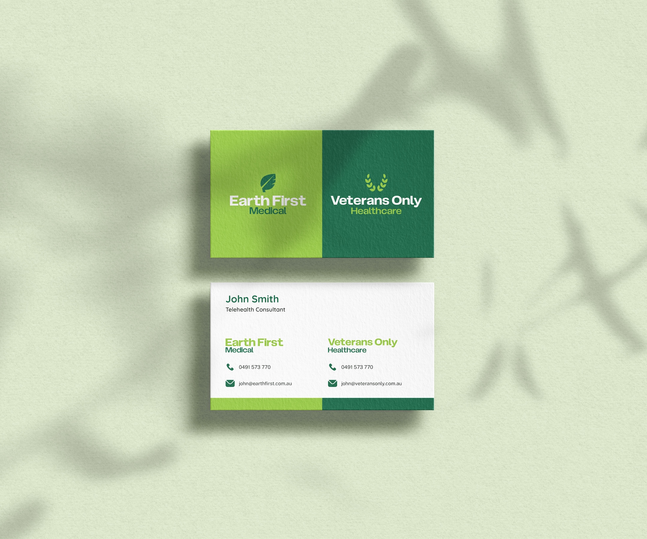
Earth First Medical
The Earth First Medical identity was designed to feel bold, calming, and contemporary.
At the centre of the logo is a stylised leaf icon, shaped to subtly suggest the letter “E”. This created a strong visual anchor for the brand without becoming too literal or relying on restricted category cues. The smooth, rounded form gives the identity a sense of softness and approachability, while the overall structure keeps it feeling professional and considered.
The typeface is clean, modern, and highly legible, supporting the brand’s digital-first service model. Together, the icon and wordmark create an identity that feels natural, accessible, and trustworthy — suitable for a telehealth brand designed to support people through personal healthcare journeys.
To ensure flexibility, the logo system included multiple lockups, including stacked and horizontal versions, full logo formats, icon-only assets, and wordmark-only options.
Veterans Only Healthcare
Veterans Only Healthcare required a slightly different emotional tone.
The identity needed to feel respectful and credible, while avoiding the obvious visual clichés often associated with veteran-focused services. Rather than using traditional military-inspired imagery, we developed a custom wreath icon that subtly forms the shape of a “V”.
This gave the brand a sense of dignity, recognition, and strength without feeling overly formal or emotionally heavy. It also helped the identity feel modern and healthcare-appropriate, while still acknowledging the specific audience it was created to serve.
By pairing the custom icon with the same stylised sans serif typeface used in the Earth First Medical identity, we created clear alignment between the two brands. The result was a logo system that felt connected to the broader brand family, while still holding its own distinct purpose.
Brand Guidelines & Collateral
A key part of the project was the development of a single, unified brand guidelines document.
Because the business was launching with two aligned sub-brands, consistency was essential. The guidelines needed to make the system easy to understand and apply — not only for the client, but for any future team members, designers, marketers, or external providers working with the brands.
The guidelines documented the strategy, logo usage, colour system, typography, brand applications, and broader visual direction. This gave the client a practical foundation for building brand recognition over time and ensured both sub-brands could grow without drifting apart visually.
We also created supporting brand collateral and templates, including items such as letterheads and business cards, giving the client a suite of practical assets ready for launch.
The Outcome
The final result was a bold, polished, and highly adaptable brand system that gave Earth First Medical and Veterans Only Healthcare a strong foundation to enter the market.
Both brands felt distinct, but intentionally connected. Earth First Medical leaned into calm, natural, digital-first healthcare, while Veterans Only Healthcare carried a more respectful, audience-specific tone. Together, they formed a cohesive brand family that could support the business across multiple patient segments.
The project also successfully navigated the restrictions of a regulated healthcare space. By avoiding direct category references and building the identity around broader ideas of care, wellbeing, accessibility, and trust, we were able to create a brand system that felt relevant without crossing compliance boundaries.
For the client, the key value was clarity. They walked away with more than a logo — they had a complete brand foundation, a flexible asset system, and a clear set of guidelines to support future growth.
Key Deliverables
- Brand strategy and creative direction
- Logo design for Earth First Medical
- Logo design for Veterans Only Healthcare
- Dual sub-brand identity system
- Logo lockups and responsive logo variations
- Typography and colour direction
- Brand guidelines documentation
- Stationery and collateral templates
- Digital mockups and brand application examples