Creating a bold, precision-led identity for an automotive engineering brand
Stoich Engineering & Automotive is an automotive hobby turned small business, specialising in custom 3D-printed interior components for enthusiast vehicles.
Formerly known as 3D-Eseries, the brand focuses on producing like-for-like factory replacement and upgrade parts — particularly head unit surrounds, gauge mounts, and other interior components designed to match OEM fit, finish, and overall quality.
Founded by Lucas, who brings more than 15 years of experience in automotive and mechanical engineering, Stoich was built from a genuine passion for cars, engineering, and the motoring enthusiast community. The business fills an important gap for owners of classic and enthusiast vehicles, where original parts are often hard to find and aftermarket options do not always meet the standard people are looking for.
Spacey Studios was engaged to create a bold new brand identity that could help Stoich move beyond its original 3D-Eseries name and present itself as a more refined, recognisable, and scalable automotive brand.
The Challenge
Stoich needed an identity that felt credible within the automotive and motorsport world.
The brand had to communicate precision, technical skill, and enthusiast authenticity, while still feeling modern and visually distinctive. It needed to appeal to people who care deeply about their vehicles and notice the details — especially when it comes to fit, finish, and quality.
The identity also needed to work across a wide range of real-world applications. From product labels and packaging through to website UI, decals, apparel, and workshop assets, the brand had to be bold, legible, and adaptable.
The challenge was to create something that felt engineered and performance-led without becoming too cold, corporate, or generic.
The Approach
We approached the identity as a performance brand.
The creative direction needed to feel sharp, technical, and built for real-world use. Rather than creating something overly decorative, we focused on a confident wordmark that could hold its own across small and large applications.
The goal was to build a visual identity with enough personality to feel ownable, but enough restraint to feel practical. Motorsport-inspired brands often rely heavily on aggressive visual clichés, so we wanted the identity to feel connected to automotive culture in a more subtle and intentional way.
This led us toward a clean, high-contrast system built around precision, instrumentation, and performance.
The Brand Identity
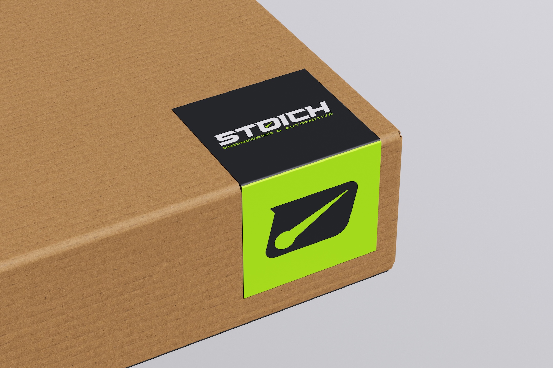
The final identity centres on a bold custom wordmark designed to feel fast, engineered, and modern.
A key detail is the needle and gauge-inspired treatment integrated into the “O”. This gives the logo a subtle automotive cue, referencing instrumentation, measurement, and precision without becoming too literal.
It also connects naturally to the meaning behind the Stoich name. “Stoich” is short for stoichiometry — a term from chemistry and engineering that refers to measuring and calculating precise ratios in reactions. For the brand, this reflects the mindset behind the products: accuracy, detail, and factory-level precision.
This visual detail gives the identity a strong brand signature, helping it feel distinct while reinforcing the engineering-led nature of the business.
Colour Direction
Stoich’s core identity naturally called for a clean technical base of black, white, and greys.
To bring more energy and impact to the system, we explored accent colours that could support digital touchpoints, packaging highlights, decals, and apparel applications.
The final direction introduced a high-impact neon green. This colour adds a strong motorsport-inspired edge, giving the brand a sense of energy and visibility while pairing well with darker neutrals.
Used selectively, the neon green helps Stoich stand out without overwhelming the identity. It creates moments of contrast across buttons, labels, print details, merchandise, and other brand touchpoints.
The Outcome
The final brand identity gives Stoich Engineering & Automotive a more confident and scalable foundation.
The new logo system feels sharp, technical, and distinctive, while staying practical enough for real-world automotive applications. It supports the brand’s product range and future growth, giving Stoich a stronger presence across digital, packaging, merchandise, and physical touchpoints.
Most importantly, the identity feels authentic to the business. It reflects Lucas’ hands-on, engineering-first approach and the brand’s commitment to producing high-quality components for motoring enthusiasts.
The result is a brand that feels unmistakably Stoich: precise, confident, and built for people who care about the details.
Key Deliverables
- Brand identity design
- Custom logo wordmark
- Primary and supporting logo variations
- Motorsport-inspired visual direction
- Colour palette development
- Neon green accent colour system
- Digital and print-ready logo assets
- Brand application direction for packaging, apparel, and digital use