
Experience the brand new Spacey Studios website – a fusion of creativity and functionality that rebuilt the old site from the ground up. Focused on responsive design & user-friendly interface across all devices. Learn more about the project today!
Say hello to the brand new Spacey Studios website – a culmination of over 130 hours of dedicated work over the past 6 months. Our in-house project showcases the perfect fusion of our specialties and design techniques, with a focus on web design. Explore the site and witness the seamless blend of creativity and functionality. Don’t forget to provide your feedback! Experience the site on both desktop and mobile devices to appreciate the visual differences across its fully responsive design. Read on to learn more about this in-house project that we are proud to release.
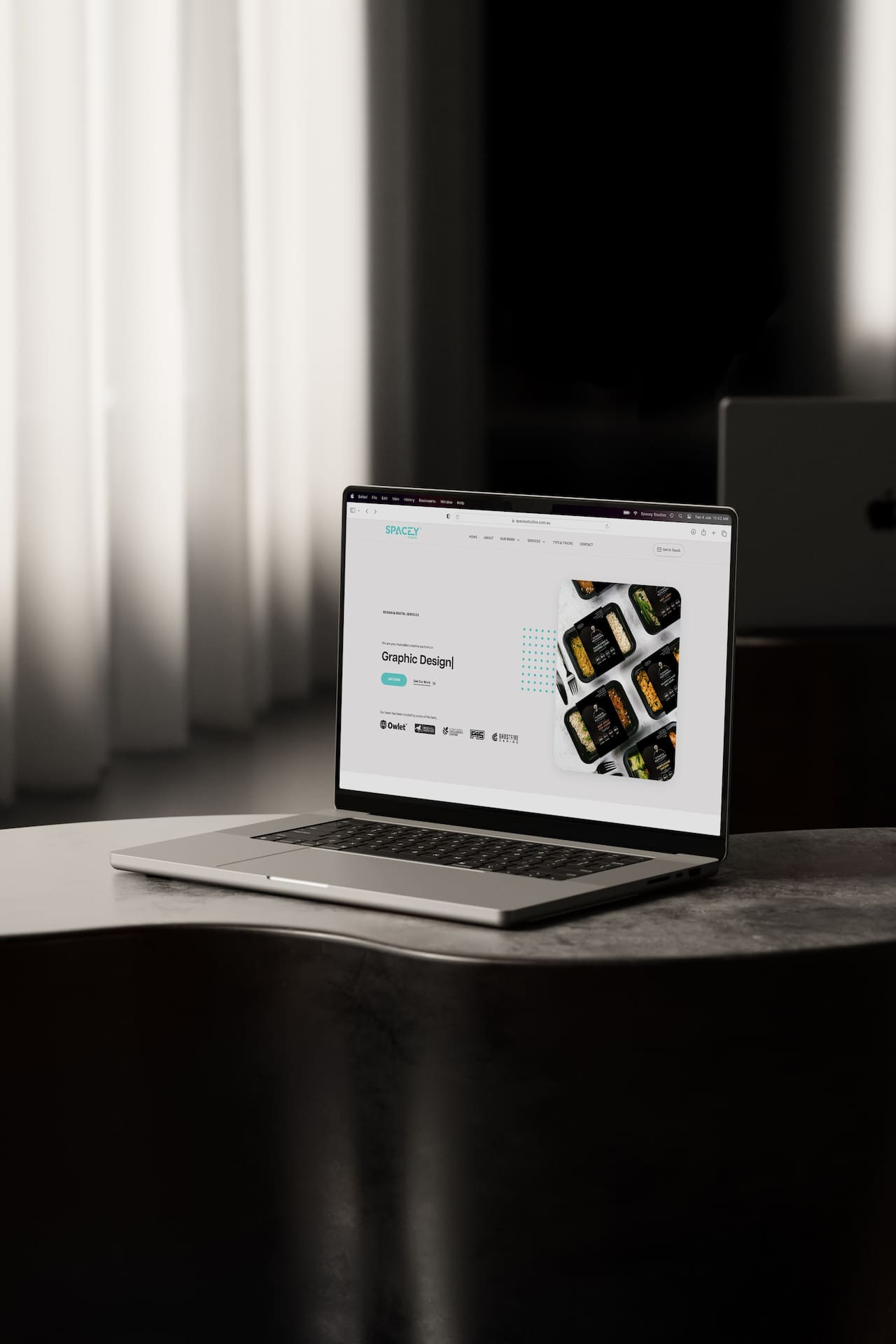
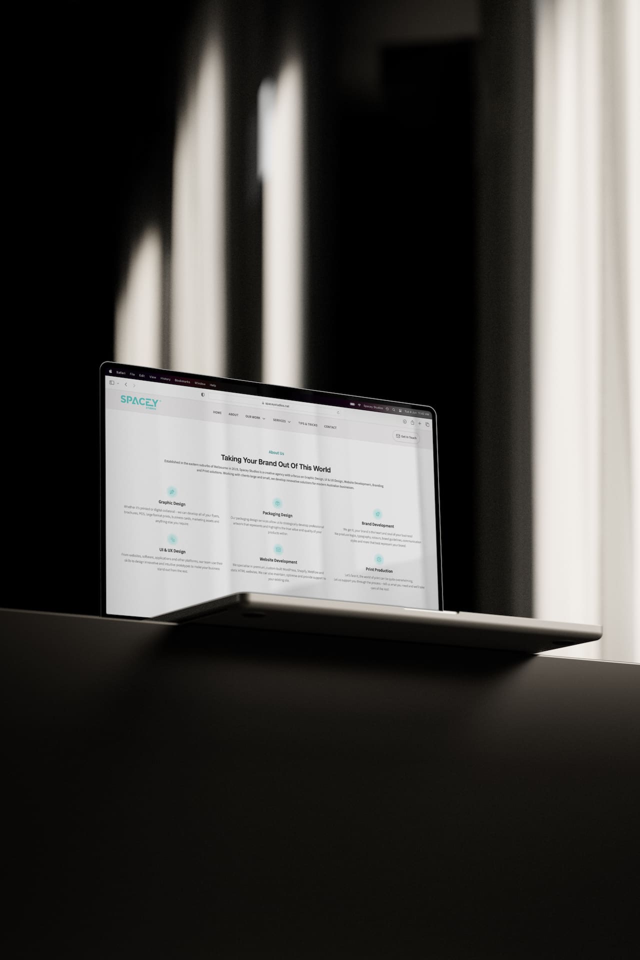
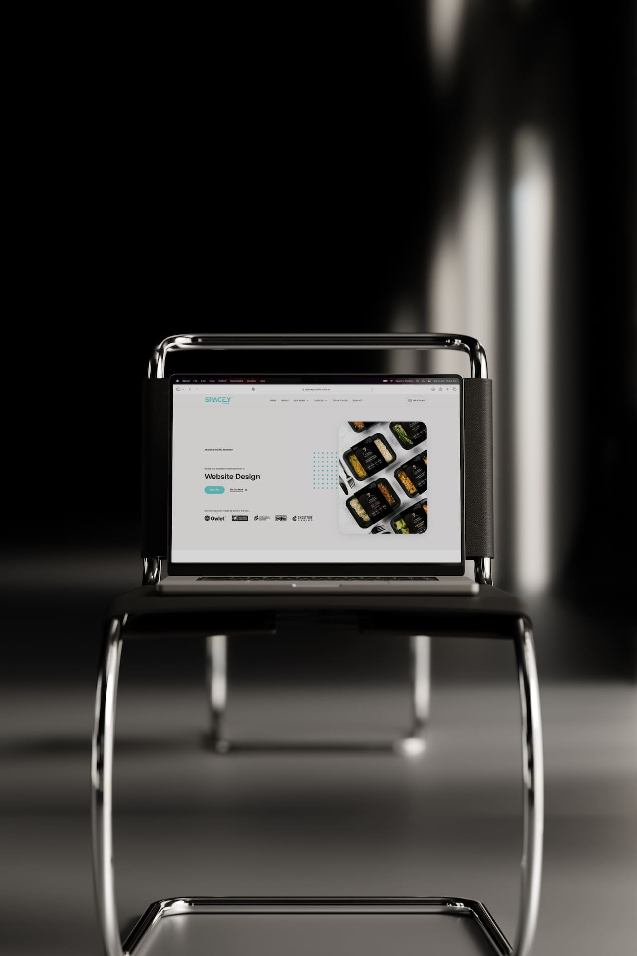
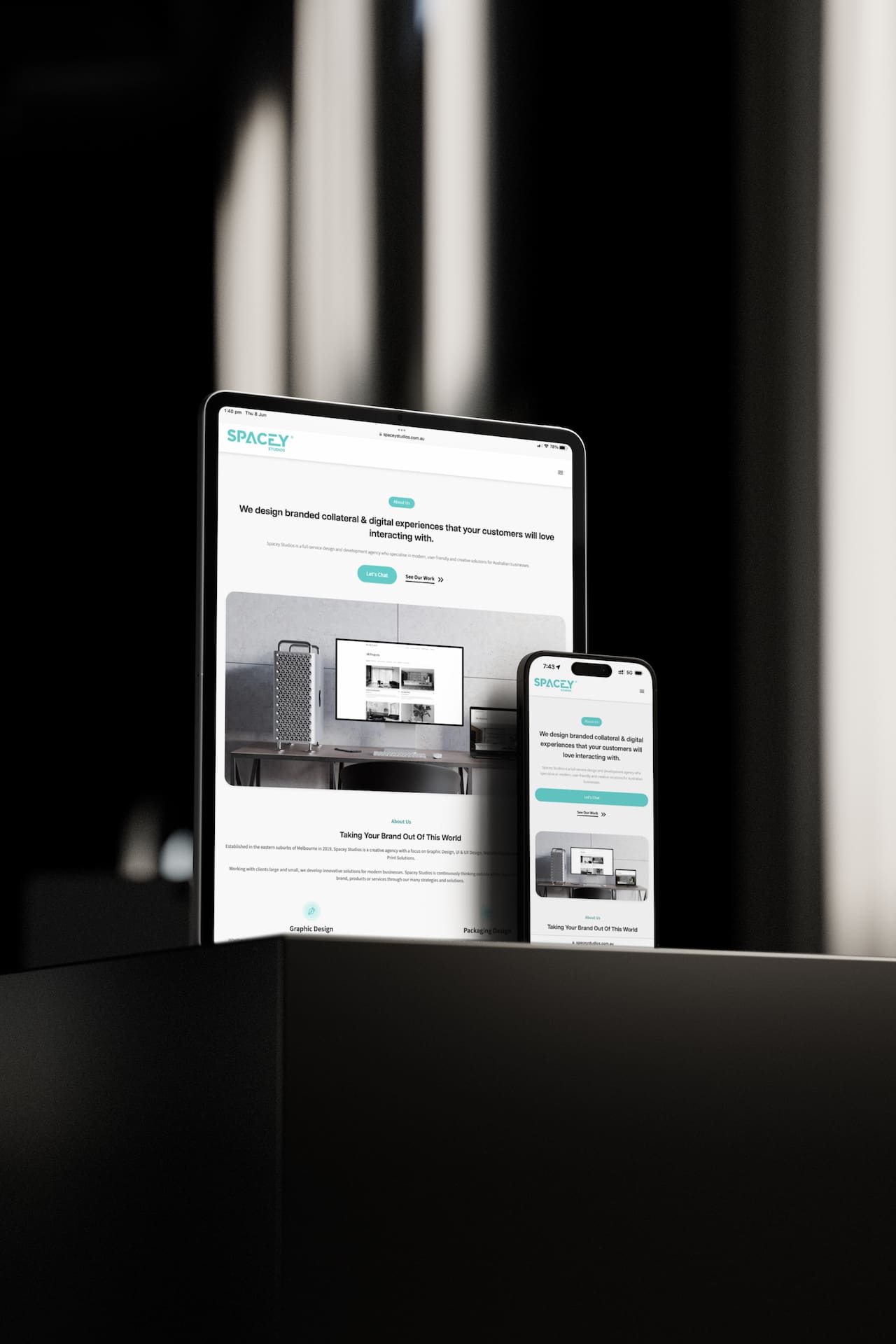
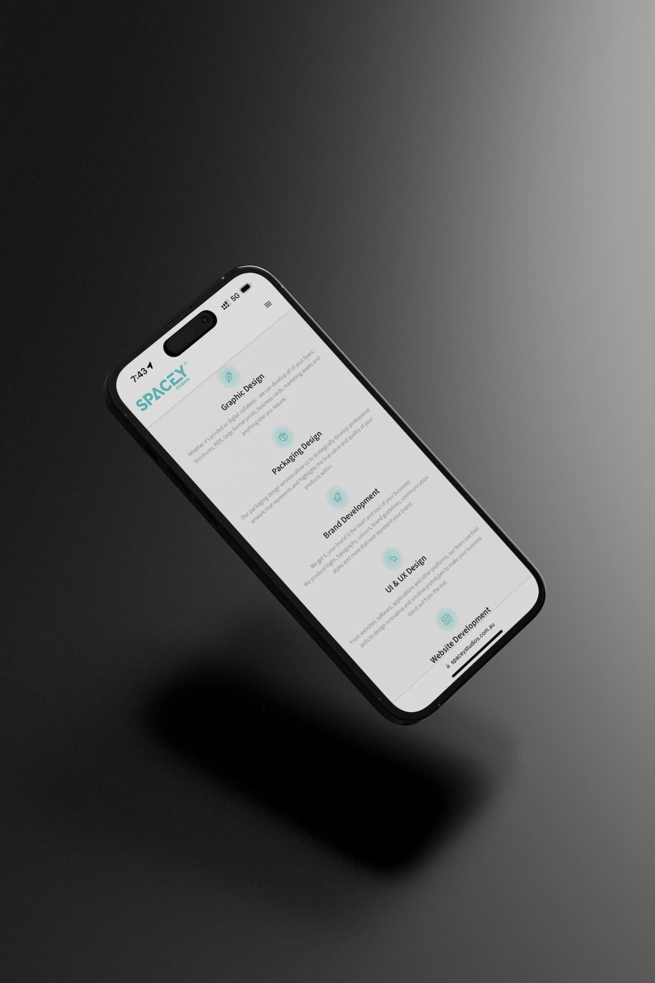
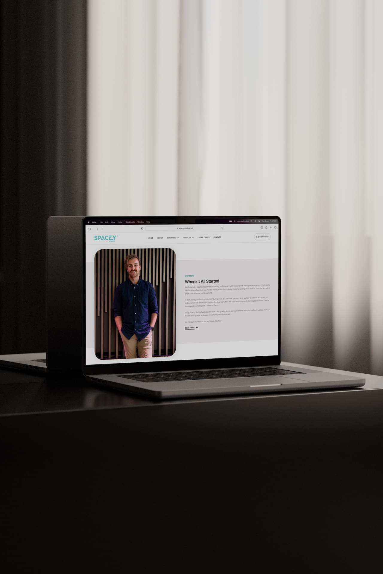
When crafting the new Spacey Studios website, we prioritised user-friendliness across all device types. Whether accessed from a desktop, tablet, or mobile, our clean and modern design ensures a positive browsing experience. The content is presented in an easily digestible manner, allowing smooth navigation across each platform.
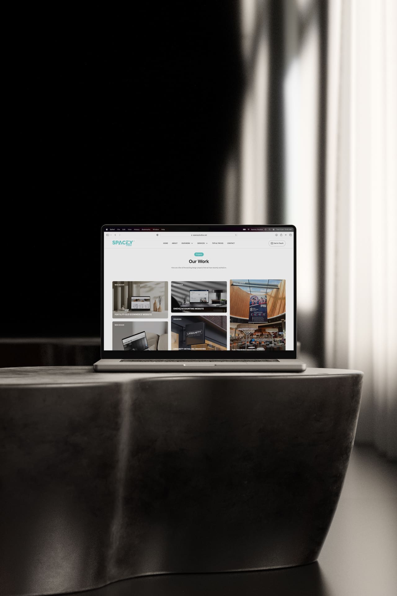
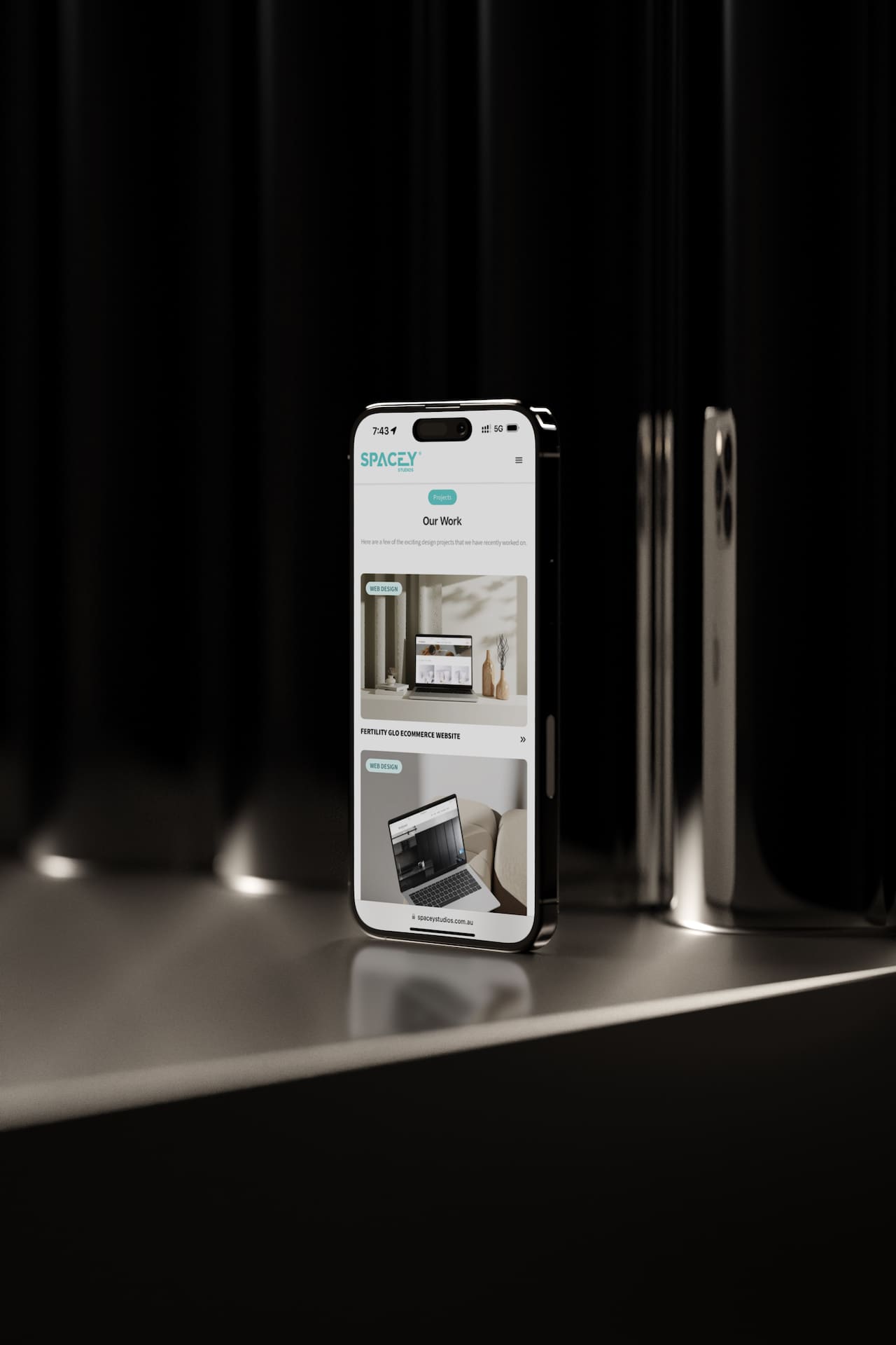
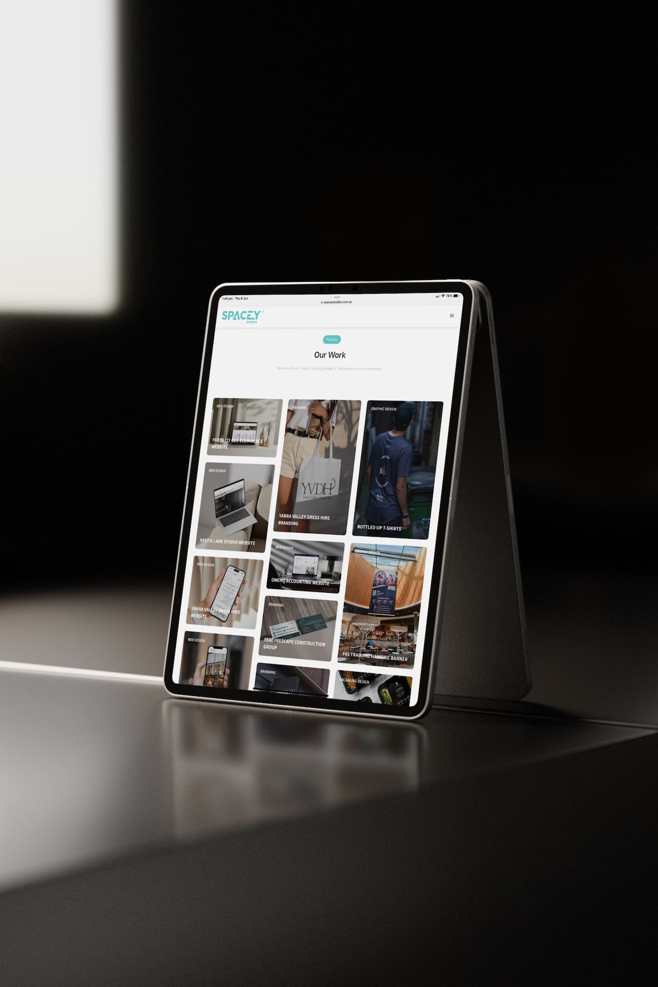
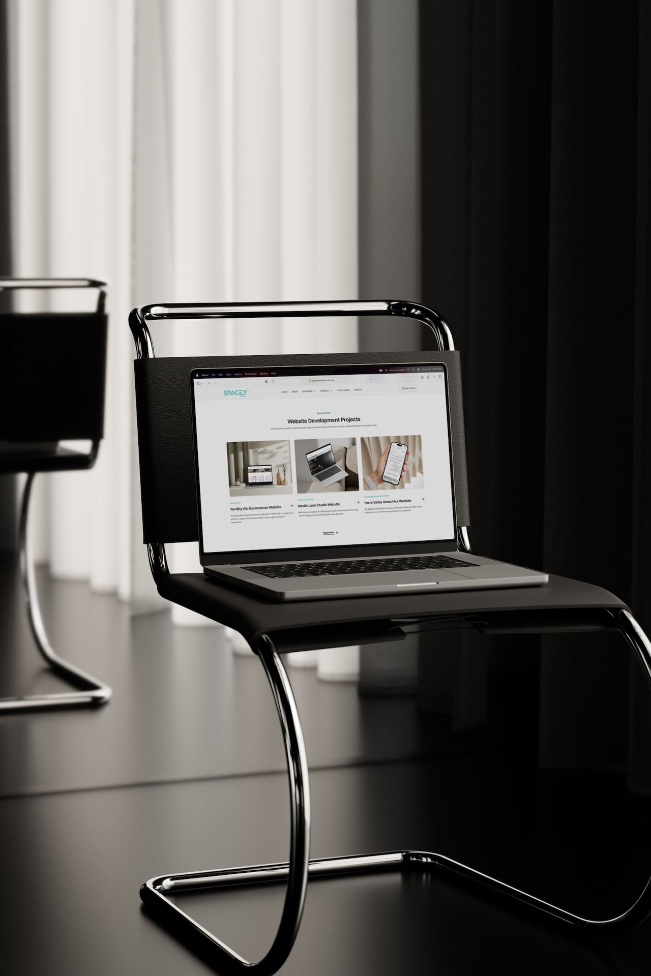
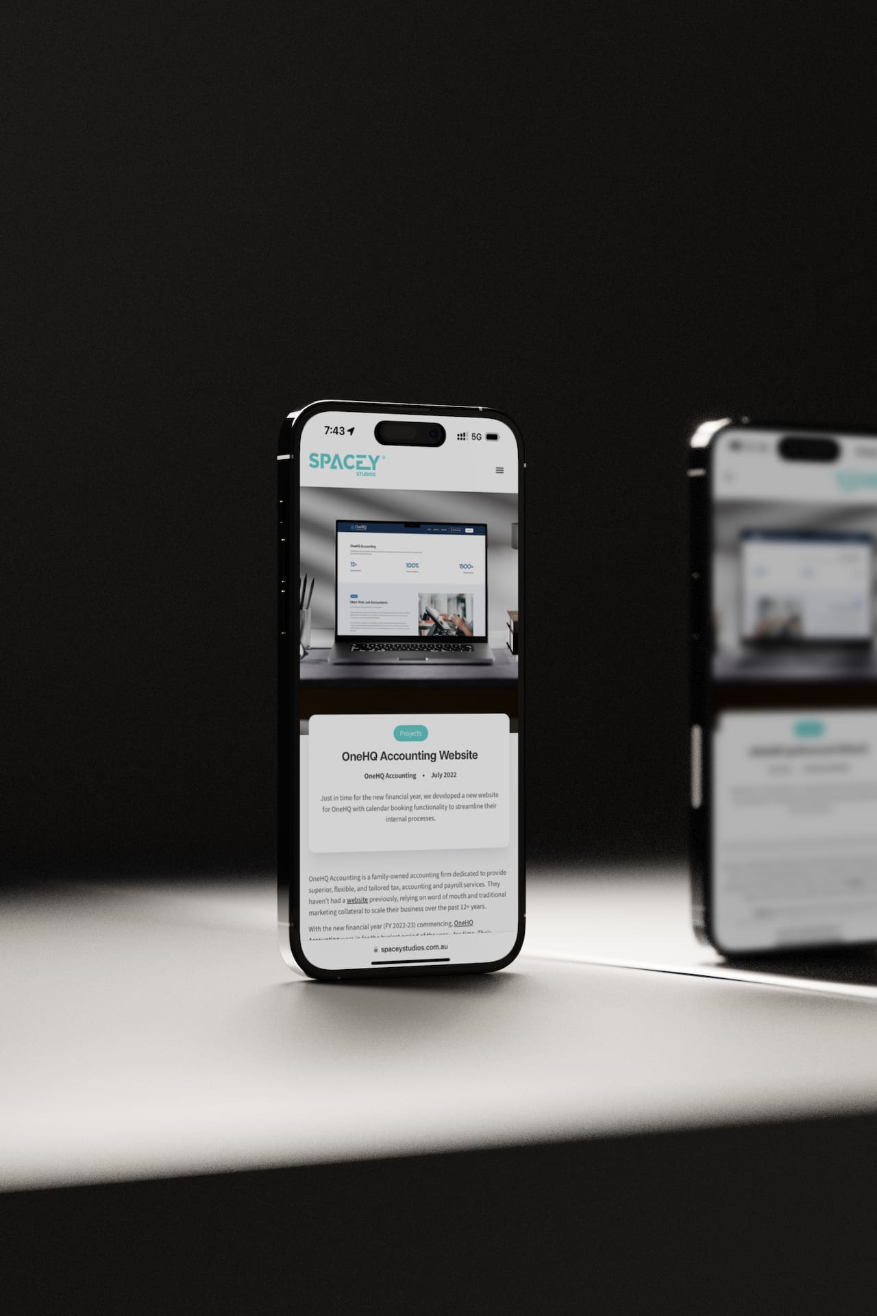
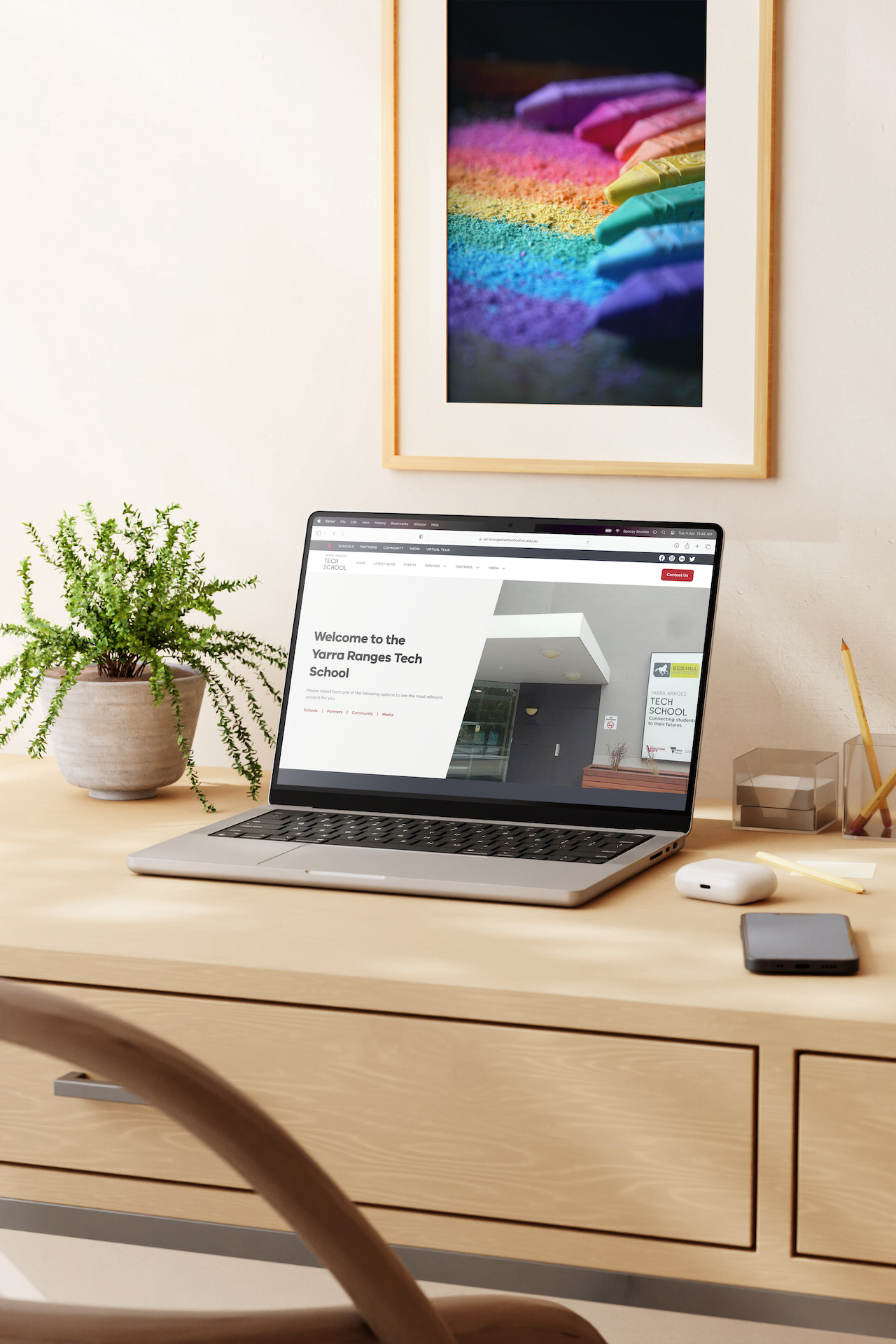
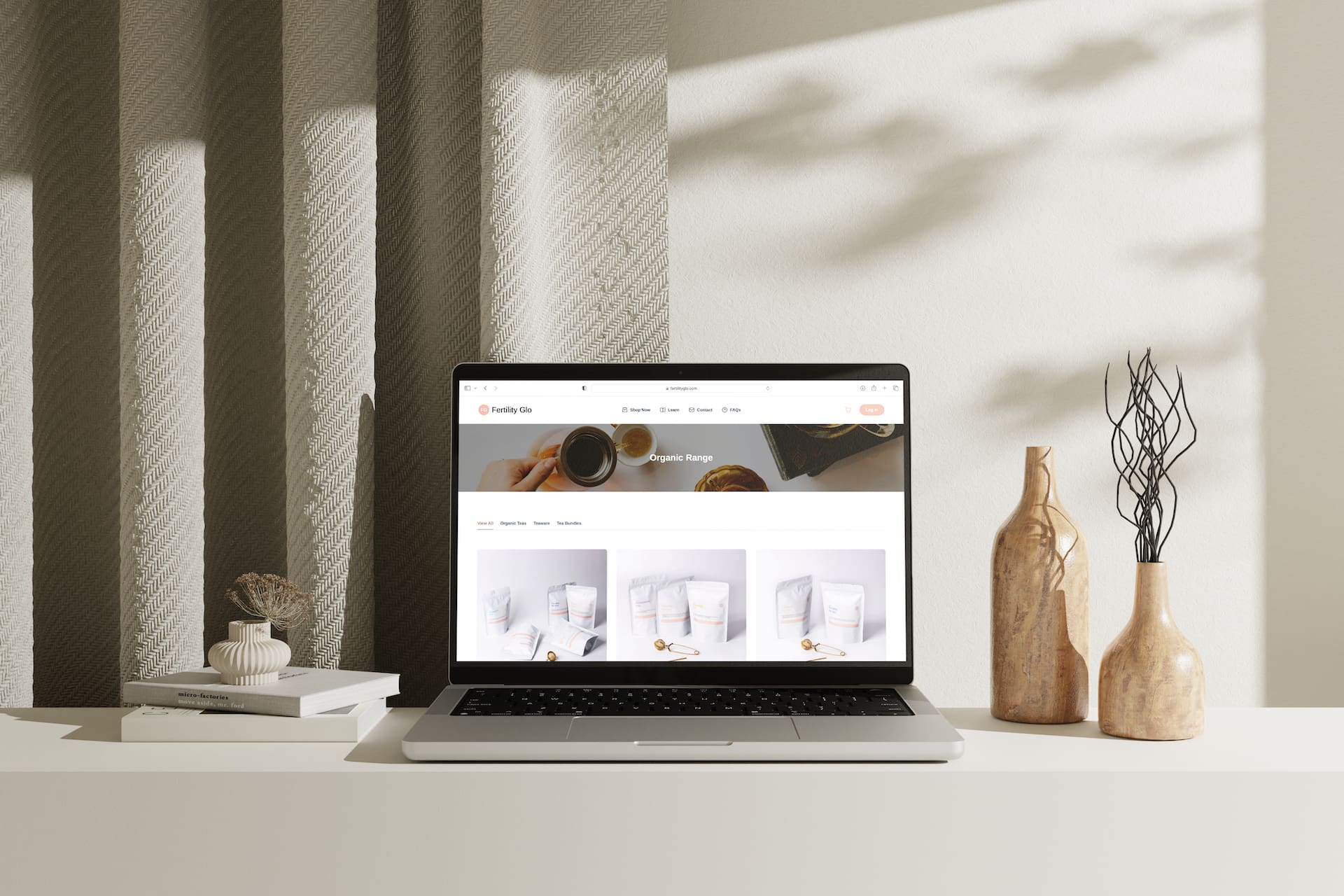
Our project feed holds great importance on our website, so we designed it to deliver an effortless content consumption experience. By implementing a dynamic 3-column grid layout that adjusts the height of each item to align with the featured image, we offer a top-level snapshot of each project across our diverse range of services. Clicking on a specific project reveals in-depth information about the work, the process involved, and an extensive gallery of related imagery to showcase the work.
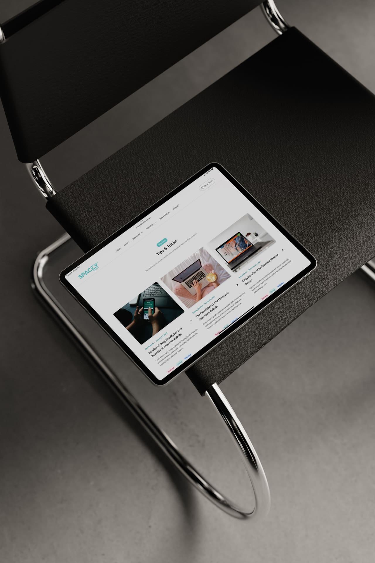
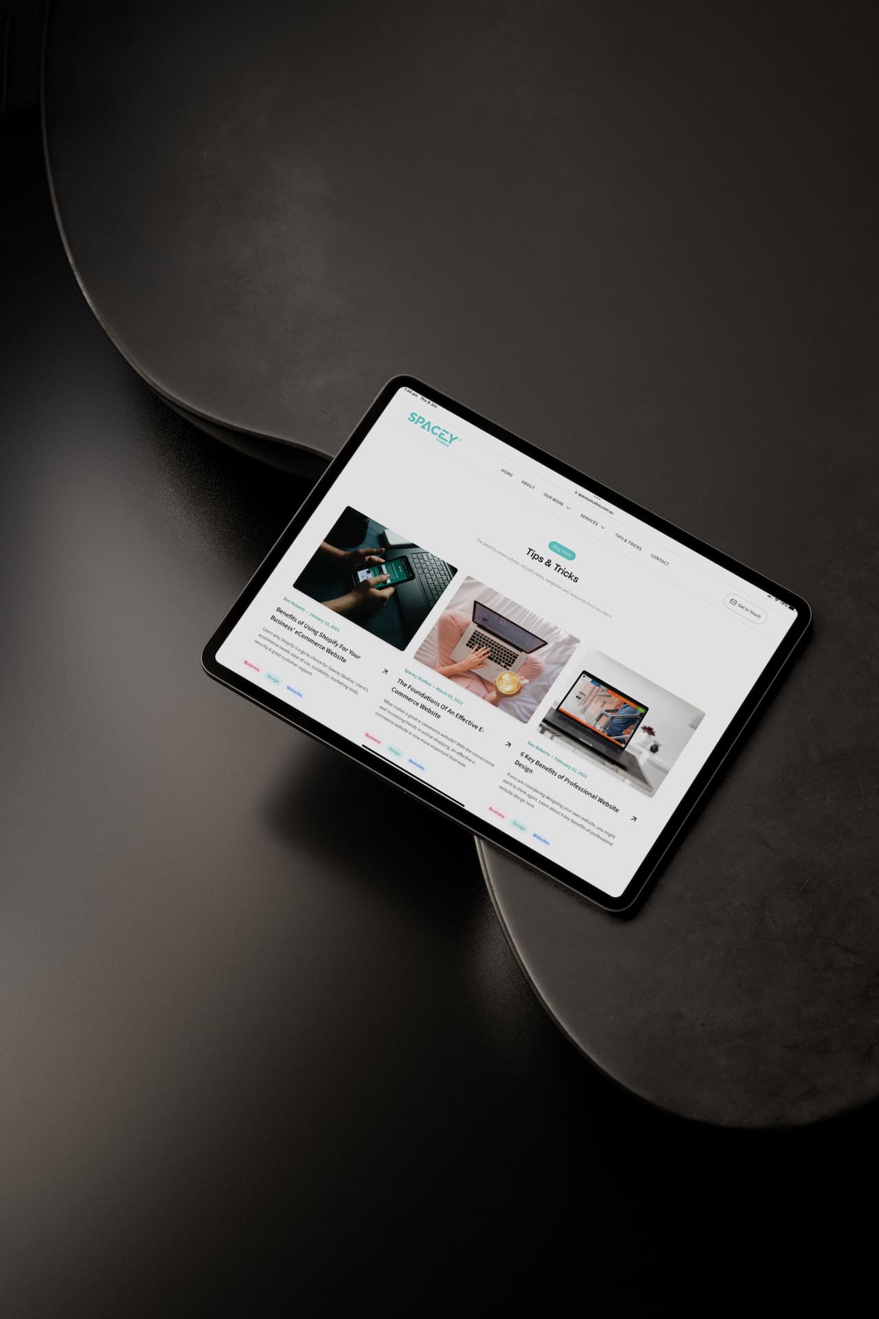
Dive into our Tips & Tricks page, a dedicated section of our website filled with valuable resources, advice, and strategies to empower your business. We focused on reducing eye strain through easy-to-read typography, clean design elements, and vibrant imagery. As we continue to share more content, our Tips & Tricks page will become an extensive library catering to managers, designers, and anyone seeking to elevate their business. So stay tuned for more content on this area of the site!
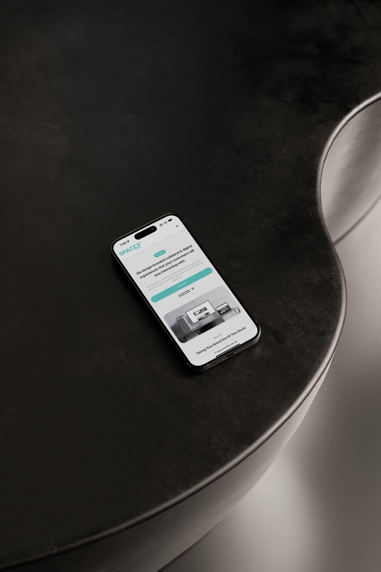
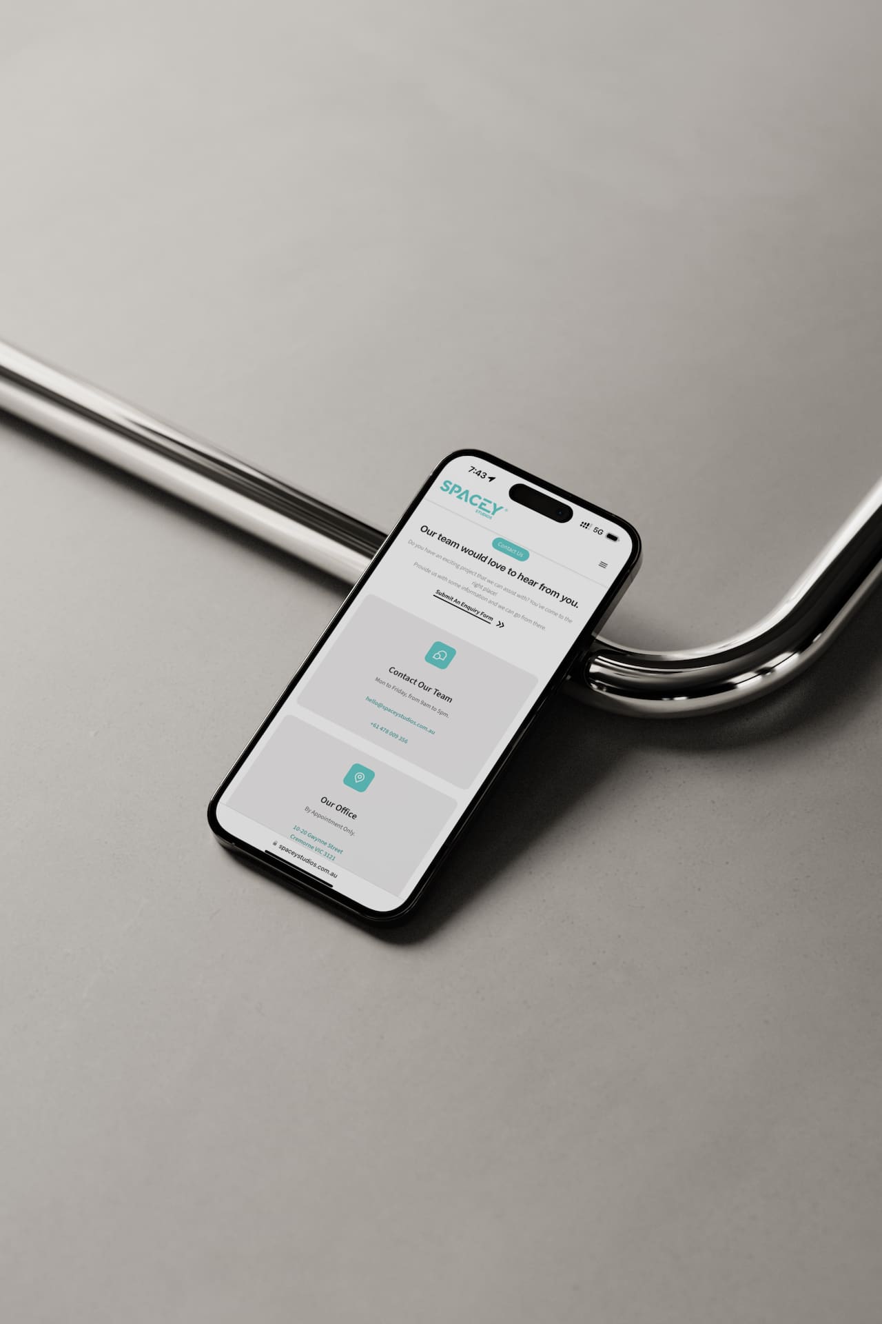
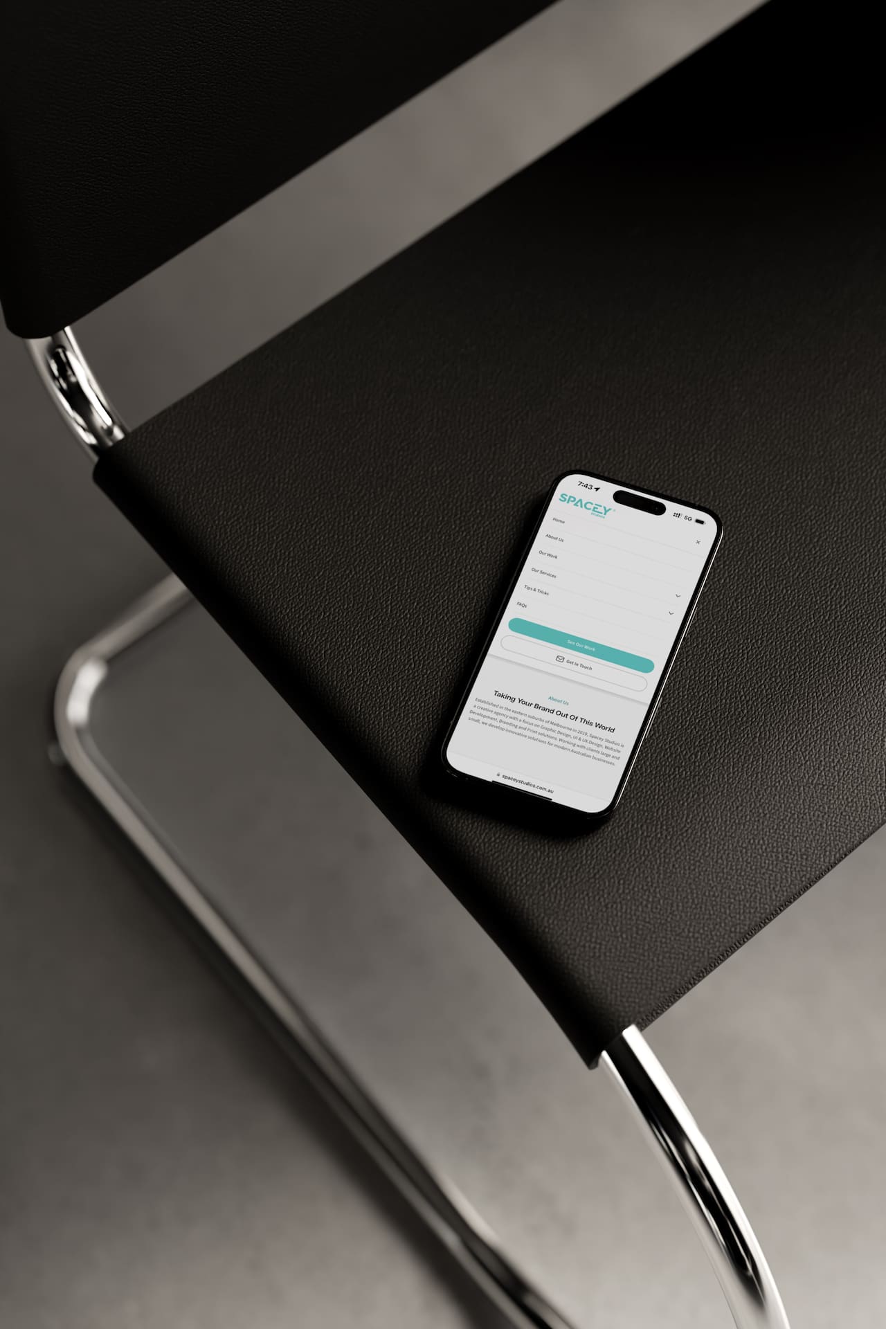
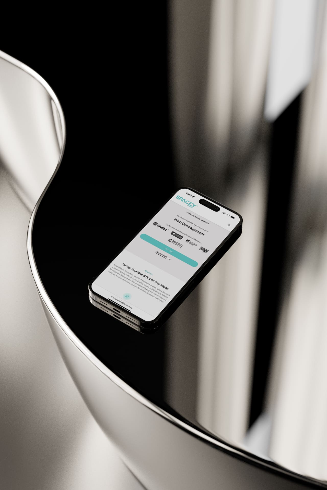
Recognising that over 30% of our website visitors access it through mobile devices, we meticulously crafted the new Spacey Studios website to deliver a seamless experience on smaller screens. Through rigorous testing, we optimised usability, navigation, performance, readability, and simplicity to ensure an exceptional user experience across all devices. The mobile design seamlessly integrates with the desktop version, providing a cohesive and user-friendly experience.
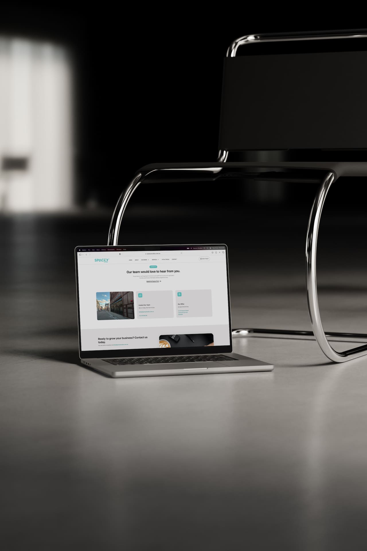
At Spacey Studios, we understand the importance of a clear and concise layout to help clients easily navigate and find the information they seek. With this in mind, we created a simple centralised hub that showcases our services, past projects, and how to get in touch for new collaborations. Take a moment to explore the site and share your thoughts with us.
An interactive website breathes life into the browsing experience, captivating users and leaving them eager to explore further. The new Spacey Studios website offers precisely that. While the mobile version provides fewer interactions than the desktop counterpart, both deliver a smooth and engaging experience across all devices, optimizing the user experience. Visit the site today and witness the seamless interactivity in action.
We’re thrilled to unveil this labor of love from over 6 months of work. It’s a showcase of our specialties and design techniques, with a particular focus on web design. Get ready to dive in and experience the seamless blend of creativity and functionality. Don’t forget to explore the site on both desktop and mobile devices to fully appreciate the visual differences across our fully responsive design. We can’t wait to hear what you think! This in-house project is a true testament to our passion, and we’re excited to share it with you.